


The first step was doing a little rough combining all the reference material. (Upper left. When I am at the drawing workshop at Bill's I tend to do one or two life drawing sketches on a page. Then as another type of compositional exercise, I add little doodles around them- either roughs for future paintings
of little studies of anything and everything. You can see more of these if you check out the sketchbook section of my Flickr site.)
Step two was doing a detailed pencil study for the painting. I'm usually very linear in this approach,
with the only real value studies on the main focus of the planned illustration.At this step I want to make sure that the drawing and perspective are correct, and eliminate any compositional problems, such as the ever present tangents that always show up. This drawing was done with a 2B pencil on illustration board (which is Bristol Board glued to a thicker backing.)

I next tape the drawing down on a piece of masonite (since it tends to warp and curl with the very wet approach I use to painting). I then do a quick wash of watercolor over the entire piece to have something to work against. Like the pencil, the watercolor will eventually be painted over. I did leave a bit of white on the dress and window, since I felt those might be white in the finish.

I work with Liquitex Acrylic paints since they are fairly smooth to put down. I also tend to water them down so it's almost like working in ink (but without the shellac they put in commercial acrylic ink). Using a mixture of Burnt Umber, Ultramarine Blue and Cadmium Red Light I draw everything in lines of varying degrees of darkness. I use sable brushes that can give me a good bit of control
for this step, usually a #1 or #3.
Taking the same three colors, I mix up pools I can use as washes to create a series of values. In this case, I tried to keep the benches, chair and back wall with warm neutrals, and the floor and trim with a cooler, and darker neutral.I use acrylics as if they were watercolors, but they tend to dry much darker and are essentially lightfast. But in the course of a painting, my board is going to see a lot of water. When I apply washes I use as large a brush as the area I'm working on will allow.

I continue with the process of washes, adding darker values to the floor and trim to create more of a feeling of depth. The window is far too light and needs to be toned down. I've also added on a lot of white opaque to create highlights on the hair and skin, and have started to flatten the dress with a coating of white. I've also added on a few highlights on Maw.

Painting is all about trial and error , and the beauty of the the studio today is that we can try things in Photoshop to see if they might work. I rescanned the painting and started working digitally. In this case, I've intensified the dark values and added a lot more opaque white. In terms of value, this is
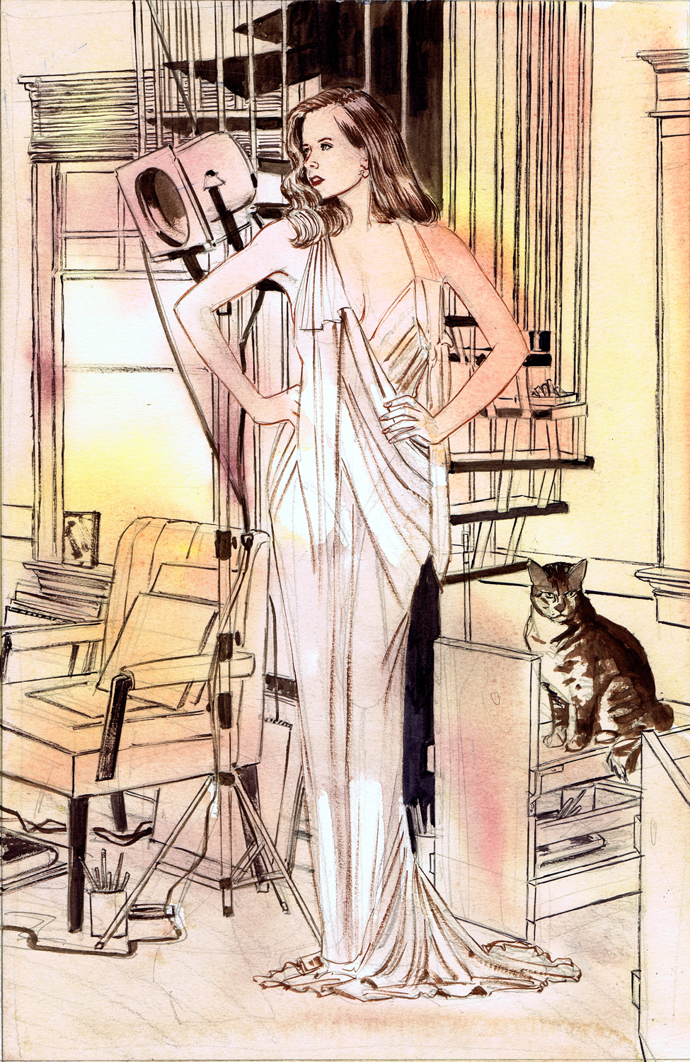
pretty much what I want for the final picture.(I should have taken a couple more scans during this process so you could see more how it progresses.) First off, using the Photoshop study I brought all the value in the background up to a finished level on the actual painting. I opaqued the window to a murky yellow that pops against the flat white I used on her gown. On the step and the braces, klieg light, tablets,etc. I've added opaques to pop things.

The most defined areas were first doing the finishes on Maw, by adding a very dark value with some opaque white and orange highlights. I then added the fleshtones and highlights on Amy, and tried to create as readable a likeness as possible, adding in the extreme darks and then highlights on her hair.
Over all this I washed a bit of local color using a very warm pallet. I generally use very little color on the paintings. I like a lot of neutrals with just a bit of color to pop things.Over the entire painting I added a wash of very light yellow orange. When this was dry, I went back and punched up the white on the dress and a few highlights on her flesh.

Whenever you're working on a painting, when to stop is always the major consideration. All of us have stacks of things where we should have quit earlier; and that is balanced by looking at a framed painting sometime later and realizing you should have taken it a couple of steps further. And there is always a spontaneity and life in the work at some time in the process that is always so difficult to keep in the final product.
I'm certainly not a proponent of "my way or the highway", especially with something as nebulous as the process of painting. If something works, stick with it, if not, continue on your highway and enjoy the ride. That's what makes the creative process so interesting.
Really great to see it broken down like this Mike!
ReplyDeleteThis is wonderful! I added your link to my blog!
ReplyDelete