Sunday, June 26, 2011

Tom and Jen

 (A sketch of Jen I did at HBO)


Two of the dear friends I've been blessed with over the years are Tom Nelson and Jennifer Yuh Nelson. You couldn't ask for a kinder, gentler, more gracious pair.

I first met Tom and Jen when I was working at HBO Animation on Spawn. We were all doing storyboards and shared the corner penthouse office (42 Floor) in the Twin Tower Buildings in Century City. While I was working diligently away, Tom was listening with great sympathy to Jen's current romantic situation. ("How could anyone every treat YOU like that,Jen...). Then Tom asked our boss Catherine Winder (another wonderful person and great friend...but that's another post) if he could move to another office. Then he moved back into our office. Was I the only one working during that time because Tom and Jen sure seemed to spend a lot of time talking together.

(My wife Annie in our HBO office; Tom and Jen and Jen's mom at the Emmy's; me hard at work)

"You know", I remarked to my wife Annie,"I think  Tom and Jen are going to end up together." She was skeptical...but I knew better. Next thing I know they are married; and I didn't even get asked to the wedding. Well no one did...it was a small family affair.


(A design sheet I created with Tom as one of the VERY out of character villains.)

After HBO, when Tom was working on Harry Potter merchandising, he brought me into the project, and I returned the favor when the Narnia movies rolled around, and later on we both wound up on Stan Lee Presents. His work always amazed me in it's simplicity and emotion. Whenever we went into a meeting, Tom was always convinced they were going to fire him. I knew different. I just wanted to stay friends with him so they would continue to use me.  When you're good, you're good.  Tom's latest was storyboarding the Thor movie.


(A sample of Tom's boards from Prince Caspian.)

Jen's dark sense of humor and incredible artistry seemed to go hand in hand. Her work was always a treat to look at. And even though she still has never seen Casablanca,  she can still tell a pretty good story.
(A cell from Spawn featuring Tom, Jen and myself as the addicts in an alley)

Jen has gone on in her own direction, working at Dreamworks since she left HBO.(Oh how I wish I could print the little poem she wrote for her letter of resignation!) Just recently she became the first woman to be the solo director of a major animated film, Kung Fu Panda II. But enough about her. Just listen to her interviews on NPR, or read Variety, or watch footage from Cannes. She's a celebrity.
(Another sketch of Jen from the HBO days)

So you have these two incredibly talented artists living together. What amazes me about them is that they simply aren't competitive with each other. Haven't they ever seen A Star is Born? But congratulations to them both. It's good to see that in a world where the bad sleep well, good people also reap rewards.

Sunday, June 19, 2011

Retrowood Page-Start to Finish


(Here is a page of my thumbnails for Retrowood. Page 4 is at the bottom right.)

Recently I started working on another Retrowood story.  Well, that is a relative term, since I actually started working on this story a few years back and took it to a thumbnail stage. Now I'm in the process of doing the finished art.

Most of my career I have been working on comic books pages that will end up as traditional "pages in print". However, with this recent project it has become increasing clear, that the work should be prepared for digital publication. And  working digitally presents you with a lot of options.

I look at the work of folks like Anthony Diecidue, Marcos Mateu-Mestre and Dan Milligan and their painterly approach to the work, and I really have thoughts about emulating their styles. But I am also in love (and a slave) to the traditional process of black line drawing...which is how I was trained and a system with which I have much greater facility.
 (These frames were all "inked" using the cintiq)

So while I stuck basically with what I am familiar with, I am still trying to learn and incorporate new things into the process. But the bottom line is that the work will end up being seen on a screen, and not as printed material that you hold in your hands. So you adapt.


Once I've worked out the plots on the stories I then do a quick version of the book as thumbnails. I try to keep these as simple and as bold as possible. I think every artist struggles with the decision between spontaneity  and precision. There is always a life in the rough drawings that is missing in the finishes; but there is also a quality to the finish that isn't there at the beginning. You just have to try and reach a happy medium. My cronies are always suggesting that I work more in my looser storyboard style for my comics, and believe me I am always trying to achieve that end- but it is unbelievably easier said than done.
(The next three frames are my pencilled frames for the page)

Using whatever reference is needed, I work up a pencilled version of the thumbnails. When working with pencil, I try and keep a certain amount of tonality to the drawings. In the later stages when I am doing the inked version, a lot of the tone and rendering will be eliminated for a clean and simple look. I don't try to make my pencil drawings look line they were drawn in ink. Pencil is grey...ink is black.


I don't have a single approach to the inking process. Sometimes I outline everything first, and then add in blacks. In this case, I followed Noel Sickles and laid in all the black with a big brush first, and then added what pen lines were needed after that was finished. It's basically like working on a watercolor where you establish your big shapes and then refine in the latter stages.
(I wasn't happy with the face in the last frame so I redrew it.)

I literally tried things both ways on this job to see what worked the best for me. I want to become more adept at using the stylus and the cintiq, so I wound up using Photoshop to "line" a number of frames, and then added on the "brush" work. The two problems I have with this is that I while I have been using a cintiq for years, I have nowhere near the facility with that tool that I have with the traditional ones. The other problem is that I haven't worked through a process in photoshop to lay in the blacks first. So after doing a number of frames, I stuck with my traditional method.

(The basic ink done traditionally and scanned in)

Once I scanned in the inked pages, I pulled out my pencil pages again and used them while I added a layer of  pencil on top of the inks. The beauty of the digital process is that you can add this effect to soften the line and create a bit of shading. This was similar to the Craftint process I used at one time, but infinitely more subtle. I found I created a "charcaol" brush that gives me the rough texture I like for the pencil "line".
 (Here the layer of "pencil" has been added in Photoshop.)

The final step is adding on a layer of black and white tone to the work. My goal is to make these stories look as much like a 40's noir detective movie, and this technique really helps me achieve this. I find I usually lay in a flat (or gradated) tone over the entire frame, and then come back in with the airbrush tool and add in darker or lighter values as needed.
(Here the final tones have been added)
 I sometimes add a layer of opaques if I want to add in a bit of white highlights, smoke,etc. I also find that I am starting to select more of the background areas and knock them back to a dark grey, to create that bit of atmosphere. Again, I'm really looking at those folks I mentioned above to see what I can learn from them for some of these subtleties.


Another advantage of publishing online is that color is just as cheap as black and white. And while I don't want to do Retrowood as a color book, I have been toying around with converting the pages to a sepia tone. What do you think?


DON'T MISS YOUR CHANCE TO OWN YOUR COPY OF THE
LIMITED EDITION
RETROWOOD TRADEPAPERBACK.

128 PAGES

B&W WITH COLOR COVER THREE ORIGINAL STORIES WITH BONUS FEATURES INCLUDING SKETCHES AND
THUMBNAIL
PAGES.
ALL FOR ONLY
  
$25.00

EACH SIGNED COPY WILL ALSO COME WITH A PIECE OF
ORIGINAL ARTWORK FROM THE BOOK SIGNED BY VOZ!!

ONLY 200 COPIES OF THIS BOOK WILL BE MADE AVAILABLE

For more information go to: http://vozart.com/Retrowood5

Tuesday, June 14, 2011

Designing With Story


There is a great exercise in of the Famous Artists Course, called "Basic Thinking and Arranging",  where you are given three design elements and by manipulating them you work out what you want to do with your picture. I've always thought the exercise was brilliant, but I've tried to add to the process.

With the Famous Artist Course you are only dealing with design, and how reworking that can change the impact of your picture. The major element that isn't discussed in this case, is story: what is the creator of the picture trying to communicate to his viewer.

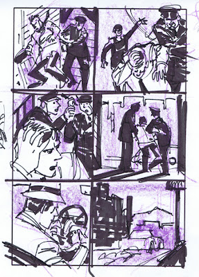
For myself as an illustrator, STORY is the essential ingredient for the design process. The Famous Artists Course stresses the concept of keeping things simple. When I am drawing a frame, I usually try to identify it by a single word (fear, disgust, death) or phrase (moves toward, hides from,etc.). Once I have that basic concept in mind I do one, or a series of quick  "thumbnail drawing." Thumbnails are small quick sketches used to plan the finished drawing. (The word “cartoon” actually defines the initial planning sketches artists used for larger works of art- now when we talk about  “cartoon” it  can be the finished work.)


Each drawing you design will probably have three or more “elements”, which make up a finished picture.An element is  simply any object (or grouping of objects) that is used to create a picture.  Each drawing in a story has a foreground (even if it’s only the panel border around the picture), a medium ground, and a background (even if it’s only a flat color.) I try not to have  more than three elements because it’s simply TOO much to ask the reader to  digest.

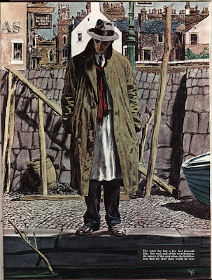
If your pictures start getting too ornate and difficult to follow you need to do some editing. Your pictures can still be complicated, but they should be concise. Often times several objects,  props, or characters, might serve as a single element, such as a crowd scene. One element might be an elaborately decorated piece of latticework, or a cityscape with people in every window. That elaborate and highly textured cityscape will still be read quickly and be assimilated if it is properly designed. My favorite illustrator is Robert Fawcett, whose pictures are always a myriad of texture and detail, but the basic shapes in the composition are always few.


Each of the elements are little clues which give the reader a hint as to what is happening in the story. As you design your pictures, decide which is the key element in each frame and make sure that is the center of attention. You don’t want your reader marvelling over your elaborate buildings if Batman is missed doing something important in another part of the frame. Each and every time you change an element in the picture you are changing something about the story. A change for aesthetics must also reflect plot. Any time any character, prop or setting has more, or less, emphasis placed on it, your story is going to change.

I prefer not to get too “finished” with my  thumbnails. This gives me the opportunity later to adjust compositions, change the angle of shots, and rework scenes if necessary. If the thumbnail  is already a tight little drawing I’m less apt to want to take the work to go back and change it. My old friend Eric Radomski got me used to using the fattest marker I could find for this process, which forces you to work with big shapes and very simply. You can always make the drawings pretty later on in the process. (And if it looks too pretty to begin with, you might hesitate to make the necessary changes. )

Your story will be told on a “stage”. It starts out bare and you will be the set designer. Two of the storytellers I really admire are Frank Miller and Will Eisner; both take a similar approach to setting their stage. Will certainly inspired Frank, but the latter has added his own unique style. They bring nothing onto their “set” that isn’t an “element” in moving the story along. While their backdrops may occasionally look very complex, there is never anything that is extraneous to the plot.

You can break all of your shots down into three basic types: Establishing (long) shot, Medium Shot and Close-up. Each of them has a specific purpose ( and an infinite variety of approaches.)

So let's look at this process using a very hackneyed plot concept: A young woman alone in a house is threatened by a maniac with a knife. The three "elements" I've chosen for this picture are 1. the woman, 2. the knife, and 3. a window.

If I were to label this frame "suspense", I might design something like the picture below. The woman is in the foreground, in danger but unaware, but the window serves as a buffer between her and the hand with the knife outside.

By changing the picture, this ups the suspense, since the woman can now SEE she in in danger.

Changing the position of the elements again changes the story and again ups the suspense. The danger for the woman is immediate....although she is now unaware.

This frame we can simply label "fear".  The woman faces an immediate confrontation.

You could also work up a series of frames where the attacker in "inside" the window, and the woman is outside. Again, it suggests a different story:"Don't go in the house!".

And the permutations are endless as you change "elements" of the elements themselves.
A butcher knife suggests something different from a stiletto, and a butter knife suddenly changes it to  comedy.


Who holds the knife is another question. In a massive hand, it suggests one thing, in a delicate hand there is a different story.

How we dress and cast the women is also essential. The sympathy of the audience reacts differently to a women dressed as a hooker, as opposed to a sweet and innocent young girl. And if the woman in the picture looks like Emma Peel, then we know it's only the attacker who is in trouble.


Whether we show a close up or the full figure is a major decision. Close ups are great for emotions,
long shots are great for setting the scene. And the emotion of the woman can change the story dramatically: is she terrified, or ready to take charge.

The window itself is also important. Does it suggest a suburban home, an office, or a mysterious gothic setting. Not to mention whether it's a bright sunny day or a dark stormy night. The more you think these things through, the more you can control what you are trying to convey to the viewer.


And lastly, how you choose your camera angles, and the lighting you set up will also be a factor.
Hey, it's not easy, is it. And just think, this is only one frame. Comics and storyboards are made of up hundreds (or thousands) of little pictures. and then there are story beats and continuity....but that's a discussion for another day.


A special thanks to Tom Wagman for suggesting I run this exercise. And to Emily Beihold for
teaching me the basics of blogging, and to Blogmaster Mitchell Reslock for putting all these blogs together for me.


Tuesday, June 7, 2011

Tales From the Crypt 3

Joel Silver was the heart and driving force behind Tales. He took a very active part in each and every show. I remember getting a call one time to Joel's office late in the run of the series. Now getting a call like that was like being summoned before the king: you were either going to get a bag a gold, or have your head chopped off. After waiting in the outer office at Silver Pictures somewhat trepidatiously for some time, I was finally ushered into Joel's office. Several people huddled around his desk; his hand suddenly shot up and he beckoned me forward:"Mike, you have to see this!"

Tales was unveiling their new website, and since I had been finishing the covers digitally for some time, everyone assumed I was a cyber wizard. So as I stood next to Joel he was proudly displaying the site on his computer monitor. He explained that all my covers were now available for viewing when you clicked on an icon- which he did. However, this was back in the days of 28k modems...and very slowly, line the line, the image started to appear on the screen, to a very impatient Joel. Finally, a bit exasperated, he said:"Well, you get the idea." And I was dismissed.

To pass the time while the picture was slowly scrolling up, I commented to Joel that he should get a trackball (the latest in 90's technology;now an item that's virtually obsolete) instead of the ineffectual mouse he was trying use. "Oh, I am going to get one," Joel assured me. About two weeks later, there was an article in the LA Times as a publicity piece for the unveiling of the Tales From the Crypt website. The first line of the article was :"Joel Silver sits manipulating his track ball in front of his computer screen." Oh, the power I had in Hollywood then. There was no bag of gold, but I didn't get my head chopped off either.

What did strike me about that episode was both Joel being considerate enough to call me in and show me the site before it went up, and secondly his enthusiasm about everything connected with the Crypt. He definitely had a passion about the work.  I also wound up doing an mock Crypt cover that appeared in Variety congratulating Joel on being named Producer of the Year. The ad was to be a surprise; apparently someone in the office got nervous and the ad was shown to Joel before it appeared, and he gave me a call to tell me what changes he needed.

Richard Donner was the other real creative partner in all this. I remember meeting him on the set during about the third season. He was very affable, and quite friendly to me. A couple days later I was back on the set again and I had brought my assistant at the time, Don Cameron, along with me. I had jokingly told him what a close friend I was with Dick Donner. We're standing on sidelines watching him work with the cinematographer when Dick spots me, stops everything and calls out, :"Mike, you've really have to see how this shot is set up. Take a look through the camera." I was a bit surprised, but as I caught his reaction out of the corner of my eye, I saw my stock with Don had gone up considerably.

It was very flattering when I was on the Warner Bros. lot a few years later to discover that Richard Donner had on one wall of his office reproductions of all my Tales covers.

Robert Zemeckis's office gave me a call at one point to see if I would some storyboards for a TV series he was doing for a show called Johnny Bago.  I showed up on the lot, where I had to follow the Zemeckis Winnebago, filled with his cinematographer and a number of others connected with the shoot, out to a location on the beach in Malibu. Once we were there, Zemeckis proceeded to run through the scene with all of these folks explaining what he was planning to do. I waited patiently on the sidelines, waiting to speak with him about what he wanted for boards. At the end of the conference, he suddenly turned to me an said, "Well, did you get all that." Of course I did! Thank god I'd been listening.

I brought in the boards a couple days later and Bob went over them all. Good! Nice shot...that works, etc. Then when he was finished he looks and me, and says, "Great stuff, but we decided to cut the scene." Nonplussed I gave him a copy of my Off-Castes series and pitched to to him. He turned it down because he was too busy working on a new project- something called "Forrest Gump."

 When Gil Adler took over the production reins in the third season, I found myself at the set on a much more regular basis. I had grown used to show then, and understood a bit more what was needed to make the covers work. Gil was very easy to work with, and very pragmatic. I'm not sure there was much of a likeness between us, but I was mistaken for Gil on the set a few times. When they were shooting "Split Personality", I looked up to see a beautiful girl in a bikini waving frantically at me. I looked behind me, didn't see anyone, and as I turned back she is walking quickly toward me. When she is about a half a dozen paces away, she stops, looks at me, and announces: "You're not the man I thought you were." My friends on the set all got a big laugh out of that one.

You couldn't help but be starstruck by the show. It seemed that everyone who was working in Hollywood at the time ended up on the show. Next time, more art and photos of my favorite shows and stars.

See more Tales From the Crypt photos at:
http://www.flickr.com/photos/vozart/sets/72157626855479920/


Friday, June 3, 2011

Tales From the Crypt 2


The first show (All Through the House) was directed by Robert Zemeckis and featured his wife at the time Mary Ellen Trainor, and Larry Drake as the pschotic Santa Claus ax murderer.I can't really remember what reference I had to work on for that first season other than head shots of the characters, and the scripts; I don't think I ever saw any outtakes.


I would do several roughs for each cover, and they would pick one. I do remember that Joel was the final say on all of them.  Whichever rough was chosen I would do a traditional pen and ink drawing. We'd get a stat shot of the cover and a negative and create a blue line version on a board which Richard Ory colored. It was much more illustration than just doing a comicbook cover.

Tales had rented a soundstage in Culver City and I'd drop off the originals at their offices there. There was a connecting door next to the business offices that led to the actual soundstage. I was never asked inside. I'd do whatever business I had with Bill Teitler and Connie Johnson and then leave. However,  at some point I remember having a problem with a likeness on one of the covers and Bill Teitler suggested that I shoot a couple of reference shots of Lea Thompson...so I finally made it behind that door.


 Lea was working with some makeup with Kevin Yeagher at the time, so I was introduced to him which was a big thrill. We chatted about art stuff for a few moments while the actress waited patiently. When I did explain to her what I needed I was amazed that she immediately snapped into character and gave me the perfect shot for the cover. She was so professional.It was definitely easier work with than getting the guys at our studio to pose for shots; and she was so much more lovely.


When the second season of Tales rolled around, I definitely made a point of asking Bill if I could shoot some photos for reference on the set. He agreed tentatively, but there were reservations. First, don't get in the way or be a nuisance to the actors. Secondly, there was already a still photographer for the show, so don't be redundant. What actually happened was that I wound up having access to the a lot of the still photographer's shots, which were all much better than anything I could have taken. And let's face it....I was much more interested in just being on a movie set than having the convenience of shooting my own reference photos.


In fact, I'm not sure how often I was on the set that second year. Certainly not more than once a week. What I learned about being on a movie set was that while the first half hour was really exciting, unless you had a specific task to do it was really a bit dull after that. I'd usually check with the office the day before to see what was being shot, show up take a few pictures, schmooze a bit with the cast and crew, and then head on my way. But the shots I took were really invaluable in creating the covers. And I also had a great source of  reference material  for my eventual Lori Lovecraft series. (In fact, I met writer Pete Ventrella through a mutual friend on Tales.)


 Next Week:Tales From the Crypt with Joel Silver, Richard Donner, Bob Zemeckisand more!