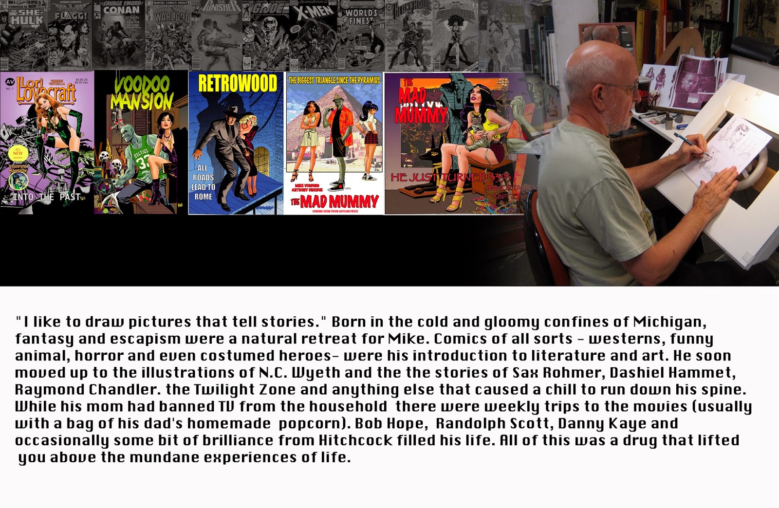
Tuesday, July 1, 2014

MAD MUMMY UPDATE


One of the things that you quickly forget when you are not working in comics is just how much work goes into the process. My goal on this book was to produce eighteen pages of story and a cover on a bi-monthly basis. What that entails is understanding how much time you have and are willing to commit and what you can do in that amount of time.  You can’t produce a fully rendered and painted illustration for each panel and produce a book on that schedule. You are always making compromises. As Jack Kirby once wisely commented, “Comics are a medium of unfinished art.” 

My original goal on the strip was to draw it in a very loose storyboard style…but I quickly abandoned that. While there is a wonderful spontaneity in that approach, there are just too many weaknesses that show up in the process. So I’m still working in my traditional comic book style. The best news is that I have a young intern, Leyanna, working with me at present who is a major help in the process. Welcome aboard!

One of the first adjustments I made was adding a nineteenth page to the stories…but placing it at the beginning of the issue to act as bit of introduction. One of the lessons you learn in comics is to make sure ALL your readers are kept in the loop as to who your protagonist is. Adding the page at the beginning gives me a good chance to do that. Currently there are two issues in the iVerse/ComicsPlus library. The artwork for the third issue is finished and colored, and I am writing the script for it this week. The black and white artwork for issue four is finished and next week I’ll start the coloring on that book. Issue five is in the thumbnail stage and I’ll begin pencilling that soon.


The third issue continues with Atan Ra (now known as Adam Ray) settling into his new residence in the northern suburbs of LA with his landlady Agnes Harperly and her two kids Jeb and Jean. But things are never simple in life, especially endless life, and the Mad Mummy goes into full battle mode to solve his current problem. (As a side note, instead of doing the artwork the normal 10 x 15 inches for a page, I drew this issue slightly smaller at 9 x 13.5 to see if kept me from noodling too much. Nope…I’ve gone back my regular size.)  


With issue four I’ve  gone back into Aten’s Ra’s past after he is rudely awakened by grave robbers and tell the story about he meets his first instructor in his study of the occult and the mystic arts. It’s not a long relationship and it’s filled with manipulation and betrayal, but it is a beginning for him in his new life. 


Issue five picks up his story several hundred years later when he is at the height of his mystic powers. And our narrator, the cat Mr. Ard, gets a break from his duties, as this tale is told to us by an English officer who is surprisingly similar to George McDonald Fraser’s Sir Harry Flashman. The location is China shortly after the TaiPing Rebellion. And of course we get at first look at Ming Yue/Ankesenamun’s father: a young Chinese doctor who will go on to become the world’s greatest terrorist of fiction in the early twentieth century.

The next two episodes will concentrate on Aten Ra’s reconnection with his estranged love’s reincarnation, Ming Yue. Everything starts at an the Egyptian Tomb of the Black Ape in l930 and ends in Malibu in the near present. And of course her father, the Chinese doctor figures in a large way in the story.  And never fear, both Mr. Ard and the Harperly family won’t be completely neglected. And soon enough all of these folks will be in the middle of a muddle with Nefertiti, a scheming billionaire, and those pesky elder gods. Stay tuned.

And if that didn't keep me busy enough, here are a few of the illustrations I've been working on lately. Everything from a version of The Third Man (where we see everyone except the third man), Lady Gaga, Vivian Leigh and a Charlie Chan piece of The Black Camel with Bela Lugosi that I was commissioned to do. 


Friday, June 13, 2014

DREW STRUZAN


DREW STRUZAN    BY Mike Vosburg

Last week was the closing of a truly incredible art show featuring two giants in the field of movie posters: Bob Peak and Drew Struzan. It was third time around at the show and this time I happened to run into Mr. Struzan himself. In a conversion with him a few years ago he turned me onto a current art auction where I was able to pick up one of my best Robert Fawcett illustrations. When I mentioned that I was able to afford Fawcett’s only because the artist worked in fugitive mediums which has kept the monetary value of his work at a modest level. He immediately pulled me over to the classic Star Wars painting and pointed out that Fawcett wasn’t the only illustrator who had problems with fading. “I talked to George (Lucas) this week and he gave me the go ahead to restore this as soon as the show closes.”,  Drew explained. 

His artwork has been an inspiration to me for many years, both the drawing facility and the brilliance of his style and design approach. When I started to branch out from comics and animation years ago I was interested in the whole concept of creating movie poster art. All of the Reel Art paintings that I've turned out over the years were definitely motivated a good deal by my love of old movies, and Drew's approach to portraiture. Below is a piece that was originally printed in the CAPS (California Artist Professional Society) Newsletter that I wrote a few years back.


“I paint in pictures what I hope people will see- the best in others.”

While watching Ken Burn’s excellent PBS documentary on Frank Lloyd Wright I was struck by a comment of Wright’s: the job of the artist isn’t simply to copy nature as he sees it, but to add his own vision to improve it. Hitchcock once said: “Drama is real life with all the boring parts left out.”   The black and white films of the thirties are an example of both these comments; the “hot light with all the boring parts left out.”   The black and white films of the thirties are an example of both these comments; the “hot light” employed by cinematographers literally created a glow around actors, adding a focus and dramatic imprint that heightened the moment. With the advent of technicolor, much of the subtle lighting techniques were abandoned for riotous splashes of unnatural color that often detracted from the story. Eventually these excesses were replaced with more naturalistic colors, and in the 80’s, with filmmakers like Spielberg and Lucas, hot dramatic lighting made a return. 


The epitome of this style in movie poster  art is Drew Struzan.

Born in Oregon City in the mid-forties, Drew’s family moved to California when he was quite young. Visually oriented as a child, his mother claimed the aptly named Drew was using pictures to communicate before he could even speak. He understood what he wanted to do with his life very early. After six years at the Art Center College of Design in LA, where his dedication was such that he often went without food to buy paint, he started his career as an illustrator.

It wasn’t an instant success. While there were freelance jobs, after two year Struzan took on a staff job creating record covers to have enough to support himself and his wife and son. From this he graduated to creating his own business with a partner doing B-movie posters for the next several years. A big break came when Charles White III, who was working on a Star Wars poster at the time, approached Drew to have him help  with the figures. It was White who introduced Struzan to the airbrush and from this collaboration his career skyrocketed. In the 80’s, Drew Struzan was arguably the best working illustrator of the time, and certainly the most visible. His posters for E.T., Indiana Jones, Hook, Back to the Future, An American Tale, Masters of the Universe and dozens of others were constantly in front of the public.


Unfortunately, creativity is bought and sold by the non-creative, who decided that photographs were much simpler to deal with for movie posters. Illustrators like Bob Peak, Dan Goozee, David Grove and Struzan were replaced by young art directors with a smattering of Photoshop.  Fortunately, Lucasfilms remains an exception, and Drew has kept quite busy  doing there movie posters, book covers, and merchandising art.

In his early work, Drew was highly influenced by other illustrators, particularly J.C. Leyendecker and Alphonse Mucha. His own style that evolved was eventually totally his own. It is based on dramatic storytelling, intricate composition and a dedication to drawing and draftsmanship. Drew speaks of the the “joy of doing” as being essential to being a good artist. His love of drawing shines through in every line; like Rembrandt, while the color is used masterfully, it’s added almost as an after effect.


Like all artists, Drew has a variety of working methods. The one I’ll describe is not his only approach, but one he demonstrated in Step by Step Graphics (Vol. 10. #1/1993) While working on an illustration,  Struzan will normally d but one he demonstrated iWhile working on an illustration,  Struzan will normally do several tightly rendered comps until both he and the client are pleased. (Drew says he does the tight comps because most clients, and people, can’t understand the visual shorthand of the artist until it is carefully delineated.) This comp is then placed in a projector and traced off a board covered with gesso. This enables him both to create a textured surface and to erase easily at any time.


The finished drawing is put together in what is referred to a Dr. Frankenstein method. From a variety of referennce (movie stills, life, photos,etc.) a head is taken from here, a boot from there, a lighting effect from a third source,etc. until Drew’s own version of the piece emerges. I’ve often hear  “artists” complain that illustrators like Rockwell just copy phottographs...and it’s obvious they have never approached the difficult job of “tracing” themselves. Like Rockwell, Struzan adds to and pluses everything from the reference - enlarging hands, changing expressions, reworking lighting- until it forms a compreheensive whole. This finished drawing, done with a variety of graphite pencils,charcoal, and Prismacolor pencils forms a complete tonal understudy for th the final illustration.

The color work goes very quickly as large areas are airbrushed in with a variety of techniques. The final touches are added with opaque paint and Prismacolor pencils. The resulting art is always simply pure magic- love produced on a board.


Success can often be the worst thing that happens to people. It makes them afraid to change and try new things.Drew is certainly someone who’s has been through the struggle of non acceptance, enjoyed phenomenal acclaim, and now enjoys a comfortable status as a master illustrator. While the public might speculate how the mighty have fallen, Struzan’s own “success” continues as his work moves forward. Frank Llloyd Wright was considered a has-been at 50, and finished the last three decades of his life with his most remarkable achievements. I have a feeling that when the illustrator is suddenly rediscovered sometime in the next century, Drew Struzan will be at the forefront.

Below are a couple of the Reel Art paintings that I did of some of the Hollywood stars. 


And lastly this post is the cover of Mad Mummy #2 which will be out shortly from iVerse (Comics Plus.) Click on the link below and type in AV Publishing in "Search"


Monday, May 19, 2014

RECENT COMICS AND ART


It's been pretty busy lately trying to keep up with my Mad Mummy comicstrip. The first issue should be available on iVerse/ComicsPlus very soon once Apple approves the content. They are also releasing the first Retrowood trade paperback this month as well as AV Publishing free preview book. Hopefully I'll have a link on this to pass on soon.


Below is a piece I did for the Stan Sakai Benefit Auction. I wish I had a link to send you to for all this art...you might just check on e-bay.


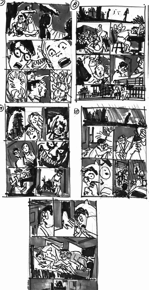
Here's a story a did three or four years ago that never got published...that's the problem when you do things for free. At any rate, it was a fun exercise, and fairly creepy...no pun intended.


I've also been doing a good bit of painting lately...just because. At the top of the page is a candid shot of Boris Karloff and Warner Oland on the set of Charlie Chan at the Opera. 
The Lady GaGa visiting Robert Fawcett's studio I started a while bit...finally got it finished. The Gary Cooper pieces are a Retrowood pinup (based on Gary and Barbara Stanwyck from Ball of Fire),and an illustration of Cooper and his early heartthrob, Lupe Valez.