There is a great exercise in of the Famous Artists Course, called "Basic Thinking and Arranging", where you are given three design elements and by manipulating them you work out what you want to do with your picture. I've always thought the exercise was brilliant, but I've tried to add to the process.
With the Famous Artist Course you are only dealing with design, and how reworking that can change the impact of your picture. The major element that isn't discussed in this case, is story: what is the creator of the picture trying to communicate to his viewer.
For myself as an illustrator, STORY is the essential ingredient for the design process. The Famous Artists Course stresses the concept of keeping things simple. When I am drawing a frame, I usually try to identify it by a single word (fear, disgust, death) or phrase (moves toward, hides from,etc.). Once I have that basic concept in mind I do one, or a series of quick "thumbnail drawing." Thumbnails are small quick sketches used to plan the finished drawing. (The word “cartoon” actually defines the initial planning sketches artists used for larger works of art- now when we talk about “cartoon” it can be the finished work.)

Each drawing you design will probably have three or more “elements”, which make up a finished picture.An element is simply any object (or grouping of objects) that is used to create a picture. Each drawing in a story has a foreground (even if it’s only the panel border around the picture), a medium ground, and a background (even if it’s only a flat color.) I try not to have more than three elements because it’s simply TOO much to ask the reader to digest.
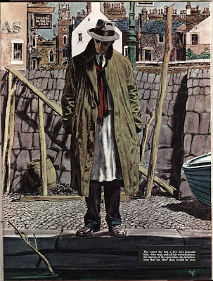
If your pictures start getting too ornate and difficult to follow you need to do some editing. Your pictures can still be complicated, but they should be concise. Often times several objects, props, or characters, might serve as a single element, such as a crowd scene. One element might be an elaborately decorated piece of latticework, or a cityscape with people in every window. That elaborate and highly textured cityscape will still be read quickly and be assimilated if it is properly designed. My favorite illustrator is Robert Fawcett, whose pictures are always a myriad of texture and detail, but the basic shapes in the composition are always few.

Each of the elements are little clues which give the reader a hint as to what is happening in the story. As you design your pictures, decide which is the key element in each frame and make sure that is the center of attention. You don’t want your reader marvelling over your elaborate buildings if Batman is missed doing something important in another part of the frame. Each and every time you change an element in the picture you are changing something about the story. A change for aesthetics must also reflect plot. Any time any character, prop or setting has more, or less, emphasis placed on it, your story is going to change.
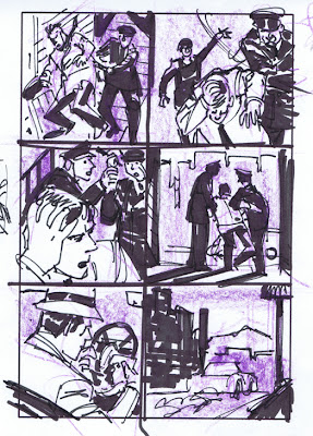
I prefer not to get too “finished” with my thumbnails. This gives me the opportunity later to adjust compositions, change the angle of shots, and rework scenes if necessary. If the thumbnail is already a tight little drawing I’m less apt to want to take the work to go back and change it. My old friend Eric Radomski got me used to using the fattest marker I could find for this process, which forces you to work with big shapes and very simply. You can always make the drawings pretty later on in the process. (And if it looks too pretty to begin with, you might hesitate to make the necessary changes. )
Your story will be told on a “stage”. It starts out bare and you will be the set designer. Two of the storytellers I really admire are Frank Miller and Will Eisner; both take a similar approach to setting their stage. Will certainly inspired Frank, but the latter has added his own unique style. They bring nothing onto their “set” that isn’t an “element” in moving the story along. While their backdrops may occasionally look very complex, there is never anything that is extraneous to the plot.
You can break all of your shots down into three basic types: Establishing (long) shot, Medium Shot and Close-up. Each of them has a specific purpose ( and an infinite variety of approaches.)
So let's look at this process using a very hackneyed plot concept: A young woman alone in a house is threatened by a maniac with a knife. The three "elements" I've chosen for this picture are 1. the woman, 2. the knife, and 3. a window.
If I were to label this frame "suspense", I might design something like the picture below. The woman is in the foreground, in danger but unaware, but the window serves as a buffer between her and the hand with the knife outside.
By changing the picture, this ups the suspense, since the woman can now SEE she in in danger.
Changing the position of the elements again changes the story and again ups the suspense. The danger for the woman is immediate....although she is now unaware.
This frame we can simply label "fear". The woman faces an immediate confrontation.
You could also work up a series of frames where the attacker in "inside" the window, and the woman is outside. Again, it suggests a different story:"Don't go in the house!".
And the permutations are endless as you change "elements" of the elements themselves.
A butcher knife suggests something different from a stiletto, and a butter knife suddenly changes it to comedy.
Who holds the knife is another question. In a massive hand, it suggests one thing, in a delicate hand there is a different story.
How we dress and cast the women is also essential. The sympathy of the audience reacts differently to a women dressed as a hooker, as opposed to a sweet and innocent young girl. And if the woman in the picture looks like Emma Peel, then we know it's only the attacker who is in trouble.
Whether we show a close up or the full figure is a major decision. Close ups are great for emotions,
long shots are great for setting the scene. And the emotion of the woman can change the story dramatically: is she terrified, or ready to take charge.
The window itself is also important. Does it suggest a suburban home, an office, or a mysterious gothic setting. Not to mention whether it's a bright sunny day or a dark stormy night. The more you think these things through, the more you can control what you are trying to convey to the viewer.
And lastly, how you choose your camera angles, and the lighting you set up will also be a factor.
Hey, it's not easy, is it. And just think, this is only one frame. Comics and storyboards are made of up hundreds (or thousands) of little pictures. and then there are story beats and continuity....but that's a discussion for another day.
A special thanks to Tom Wagman for suggesting I run this exercise. And to Emily Beihold for
teaching me the basics of blogging, and to Blogmaster Mitchell Reslock for putting all these blogs together for me.

