Saturday, November 25, 2017

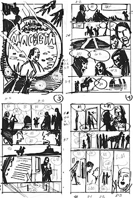
The Staging of Macbeth PT. 1


When I was a youngster, my favorite comics were always the Classics Illustrated series, so as a professional it was my good fortune to actually do three jobs that were adaptations of classic material. One was Kidnapped (CLICK HERE) and the other two were for Boy's Life Magazine: The Hound of the Baskerville's (CLICK HERE) and Macbeth(CLICK HERE)

These jobs  required a lot more preparation than the normal work.When you're doing period pieces, you have to be extremely accurate with costumes and settings. Their are a thousand little details you have to deal with.

On Macbeth not only did I have the advantage of working on a Shakespeare play, but I also have an excellent sci-fi writer, the late Suzette Haden Elgin. The biggest problem for both of us was reducing a five act play to sixteen pages of comic book material.


Step one was doing character designs for all the principal players. For this I used several costume book for accurate reference. I also went to a number of famous illustrators like N.C. Wyeth, E.A. Abbey, Robert Fawcett and Dean Cornwell for their stylistic interpretations.

I also "cast" the actors. I used photo reference of Sean Connery for the lead, and Greta Garbo as his wife. Wherever possible, I also tracked down photo reference for the rest of the players.


The second step was to break the script down into a series of pictures that quickly and concisely moved the story along. As the compositions are worked out to best show the action, the placement of the captions and dialogue balloons are part of the process.

With penciling I make use of my character sketches, thumbnail drawings and whatever reference I have gathered. At this point most of the thinking problems have been solved and you're just slaving over the hard work of producing crisp and lively drawings. Normally, for comic books I was using the standard 10" x 15" paper size but with this story I was using 14" x 19" with the full page bleeds.


Next week: Ink the pencils and doing color roughs.


Wednesday, November 15, 2017

Mitchell Hooks


Since I know virtually nothing about Mitchell Hooks himself except that he was a fellow Detroiter,  the following is the artist's bio that appeared in Walt Reed's The Illustrator in America.

"The career of Mitchell Hooks (1923-1913), like that of many other artists of the post-World War II era has been involved to a great extent with paintings for paperback book covers. His interpretations have a strong poster quality, in keeping with the need to hold their own on display with other competing titles on the bookstands, but also have a subtlety and sensitivity that attracts a closer and longer look.


In addition to his book designs for Avon, Bantam, Dell, Popular Library and Fawcett publications, Hooks has illustrated for Costmopolitan, The Saturday Evening Post, The Ladies Home Journal, Redbook, McCall's, Woman's Day and other magazines.

Mitchell was born in Detroit, Michigan, and obtained his art education at the Cass Technical High School there. Later he studied further with James Billmeyer in New York. After the way, and Occupation duty as a Second Lieutenant in Germany, he returned to New York to begin his free-lance illustration career.

In recent years, Hooks has become more diversified, dividing his work between magazines, hardcover books, paperback covers and advertising. Hardcover books include illustrations for The Franklin Library, Reader's Digest Books and Coronado Publishers."


But while I know very little about the man himself, his illustrations have  been a source of inspiration to me since I first discovered them when I started my tearsheet collection many years back. Hooks was a precise draftsman,  and despite the spontaneous style that he painted in, that quality always showed through. He had a strong sense of color and knew how to effectively and emotionally use it. But what really sold me was the way his cinematic storytelling drew you into the complicated designs of his compositions.