Thursday, July 14, 2011

Father Pat: Creating Secondary Characters


Retrowood is my attempt to do a detective graphic novel  that looks looks like a black and white Matinee movie of a bygone era. The protagonist is private detective J. Parker Wrighte, who finds on his upwardly mobile career path that every advancement comes with cost and compromise. I've avoided doing a straight period piece by condensing the history and geography of the mid-twentieth century into a Depression era version of Hollywood and Los Angeles. While the stories have the hardboiled plots of Hammett and Chandler, the tone remains as whimsical as Eisner's Spirit.

While the detective is the center of all the stories, I've tried to surround him with a continually expanding cast of secondary characters that bring a nuance to his world. One of my favorites is Father Pat, the alcoholic priest who is tied to Parker's past.
(A painting of Gary Copper and the lovely Lira Kellerman for Retrowood development.)

Retrowood is a two tiered society, where there is one set of rules for the rich, and another for the poor. Parker has little interest in being a social reformer; he's far more interested in moving out, moving on, and moving up. He morphs from Jimmy into J. Parker, which he considers a much more posh title. But every time he thinks he has created a bit of distance between himself and his former surroundings, he manages to run into Father Pat.

While he was once an energetic and idealistic young priest, Father Pat has seen too much injustice and misery in his labor class parish to have much of either quality left. For him, alcohol has long been the answer as he watches the immediate world around him continue to deteriorate.

Parker desertion has been one of the tougher blows, since the priest is a sort of foster father to the detective. After Parker's own father disappeared, Father Pat began a long standing affair with the boy's mother, who is his housekeeper at the time. His mother is now dead, but Parker's sister Mary has remained close to the priest, working as a teacher at the parish school. Parker escaped the neighborhood with a college basketball scholarship. He is trying to keep the move permanent by working in the fashionable Kinchay Detective Agency and rubbing shoulders with the rich and connected. But that task is more difficult than he realizes, and Father Pat lies at the center of dilemma.


(A  sequence from an upcoming Retrowood story "All Roads Lead to Rome" with Father Pat.)


A lot of the Retrowood back story and material I tried to take out of my own life experiences.I was brought up Catholic, went to 12 years of Catholic school and taught for three years at Catholic schools. As I tell people today, I went to church almost every day of my life for the first 20+ years...but I haven't been since they stopped paying me to go. My dues are paid up for a while. If they had an All-American team for altar boys, I might have been picked for it. 

(Two pages from the "H.I. or L.O" story in the Retrowood graphic novel.)

My older brother , who was in the seminary, committed suicide at 19. Father Pat (my brother's name) is a bit of an extension of what he might have grown into had he lived. Even as a kid I could see that ifyour were rich and went into the seminary, you were eventually going to be a Monsignor or Cardinal; if you were poor you were going to wind up working at one of many low income neighborhood parishes. And growing up Pontiac, Michigan in the 50's/60's I saw a continual line of priests like Father Pat burn out in my parish .
(A few frames a Spawn storyboard with the mad priest character.)
I used my own likeness as the model for Father Pat. It's not the first time I've been cast as a priest. I was also the model for the psychotic bomber cop-killing priest in Spawn, Souls in the Balance. But despite being typecast, once I decided as a youngster not to be a cowboy or a viking, I never had any inclination to be a priest. After I saw Miiko Taka in Sayonara  at the age of  eleven, I had no interest in the celibate life. Of course I had no idea then that in the real world it wasn't necessary to take any of these rules seriously, as long as one  maintained a decorous front.

Father Pat has  learned that in Retrowood, and Jimmy Wrighte is trying to decide whether the rules or the front are more important.

(A cover rough for Gypsy Twins...enough priests...more women.)


DON'T MISS YOUR CHANCE TO OWN YOUR COPY OF THE
LIMITED EDITION
RETROWOOD TRADEPAPERBACK.

128 PAGES

B&W WITH COLOR COVER THREE ORIGINAL STORIES WITH BONUS FEATURES INCLUDING SKETCHES AND
THUMBNAIL
PAGES.
ALL FOR ONLY
  
$25.00

EACH SIGNED COPY WILL ALSO COME WITH A PIECE OF
ORIGINAL ARTWORK FROM THE BOOK SIGNED BY VOZ!!

ONLY 200 COPIES OF THIS BOOK WILL BE MADE AVAILABLE

For more information go to: http://vozart.com/Retrowood5

Saturday, July 9, 2011

No Ordinary Family


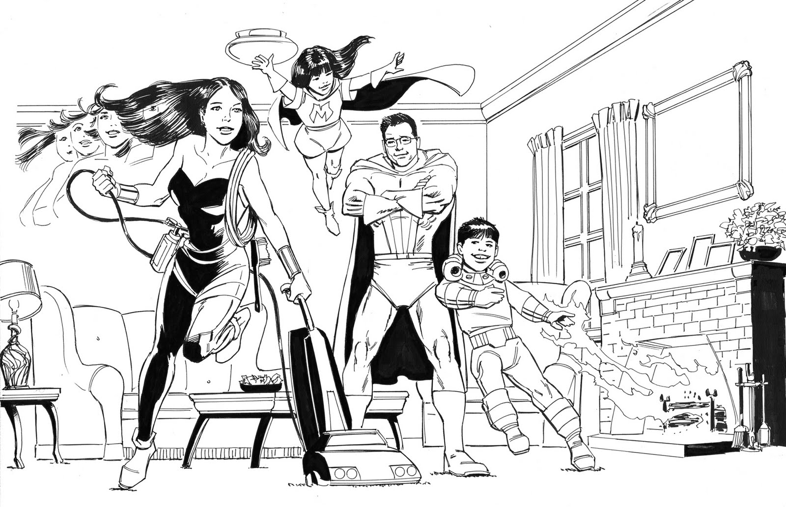
(Both of these drawing were my pencils and inks with Anthony's colors.)

One of the jobs I wound up working on last year was generated by the TV show No Ordinary Family. While I never got the exact story of why this was being done, the assignment was to create a "comicbook" type drawing featuring each of the 25 families who had taken place in a blogging contest promoting the show. In the blog the contestants all explained what would be the superpowers exhibited by their "ordinary family". The job was to design a drawing featuring all the members of the family demonstrating their super abilities.

Piece of cake....did I mention that all of these families tended to be quite large. Forget getting away with two or three figures per drawing.


(This was my initial rough- no costumes on this first drawing.)

Because of the scope of the project and the deadline involved (as usual, someone else had dropped the project for various reasons, and now the deadline had already passed ) I immediately enlisted the help of my good friends Jerry Bingham  and Anthony Diecidue , since they are both incredible talents and we work well together without a lot of ego problems. (Well, they don't have ego problems...you might want to ask them what it's like to work with me.)


(And here is the pencilled and inked versions.)

We presented a sample drawing. Likenesses on very tiny figures were an issue with the original art director. I was in the process of being close to passing on the job when the client came back with rave reviews on the what we had sent them. What with the insane deadline, after that we had carte blanche.

(Voila! Mr. Diecidue has added his magic paintbrush.)

Jerry and Anthony and I were all involved in the thumbnail/comp process. Working with the character descriptions sent by the agency, the reference photos and information from the family blogs, we would work up a rough and get it approved. Then one of us would take the drawing to a final pencil stage, get that approved, and then either I or Jerry would ink the drawing, and Anthony would provide his incredible digital coloring skills as the icing on the cake.

(One of Anthony's pencils.)

Working with good people is always the most important part of the process for me, and Anthony and Jerry, as well as our ABC liaison Kevin Costley get a big thumbs up from me. All in all, a job that could have been a nightmare was quite an enjoyable and profitable venture. The client and the agency were both quite happy with the results, and here's hoping all those families out there who received the drawings were just as pleased. 


 (Jerry Bingham's roughs and pencils with my inks.)


 (Another of Jerry's pencils with my inks.)


(Reverse! I pencil and Jerry inked this one. By now we were
 drawing costumes on virtually everyone.)


Monday, July 4, 2011

Coby Whitmore-Illustrator of the Good Life


Coby Whitmore is my favorite painter of the sophisticated romantic scene. He painted the "Good Life". As he described it his interests were “racing cars, illustrating, and smart clothes on good looking women.”

Born in Dayton Ohio in 1913 Whitmore decided to become an illustrator when he observed the dapper dress and lifestyle of McClelland Barclay, a premiere illustrator of the early 30’s. It was the Depression, and the juxtaposition of Barclay  against the poverty of the time convinced him that this was indeed the way to live.

He  moved  to Chicago. Here he used the skills he had learned while attending the Dayton Art Institute to land a job.By 1936 he was working on his own producing illustrations for the Chicago Herald Examiner. After a short stint working for a studio in Cincinnati, he moved to NYC and became a fixture at the prestigious Charles E. Cooper studio. Like his idol Barclay, he also became one of the premiere illustrators in America working for the Post,Good Housekeeping, McCalls,Ladies Home Journal, Sports Illustrated and several other top magazines.
 Elected to the Society of Illustrators Hall of Fame in 1978, he lived the last years of his life with his wife Virginia in Hilton Head, South Carolina.
(Bob McGinnis once told me that Coby was one of his idols.
You can certainly see the influence in this illustration.)

Coby worked mostly in oils, but was adept with a number of mediums. Like his contemporary Al Parker, Whitmore started his career using the painterly style popular between the wars. But like Parker, he didn’t stop there but created a graphic approach to his picturemaking, using a combination of his painting techniques with a stunning use of negative space.
 “Coby epitomizes the great sharing of knowledge and information in the tradition of history’s finest artists who pass on to others what they have learned from earlier generations. He has been the most important person in my development as an artist.”
Quote from Joe Bowler, another of America’s great illustrators and former assistant to Coby Whitmore.

For more images of Coby Whitmore, check out my Flickr set:
 

Sunday, June 26, 2011

Tom and Jen

 (A sketch of Jen I did at HBO)


Two of the dear friends I've been blessed with over the years are Tom Nelson and Jennifer Yuh Nelson. You couldn't ask for a kinder, gentler, more gracious pair.

I first met Tom and Jen when I was working at HBO Animation on Spawn. We were all doing storyboards and shared the corner penthouse office (42 Floor) in the Twin Tower Buildings in Century City. While I was working diligently away, Tom was listening with great sympathy to Jen's current romantic situation. ("How could anyone every treat YOU like that,Jen...). Then Tom asked our boss Catherine Winder (another wonderful person and great friend...but that's another post) if he could move to another office. Then he moved back into our office. Was I the only one working during that time because Tom and Jen sure seemed to spend a lot of time talking together.

(My wife Annie in our HBO office; Tom and Jen and Jen's mom at the Emmy's; me hard at work)

"You know", I remarked to my wife Annie,"I think  Tom and Jen are going to end up together." She was skeptical...but I knew better. Next thing I know they are married; and I didn't even get asked to the wedding. Well no one did...it was a small family affair.


(A design sheet I created with Tom as one of the VERY out of character villains.)

After HBO, when Tom was working on Harry Potter merchandising, he brought me into the project, and I returned the favor when the Narnia movies rolled around, and later on we both wound up on Stan Lee Presents. His work always amazed me in it's simplicity and emotion. Whenever we went into a meeting, Tom was always convinced they were going to fire him. I knew different. I just wanted to stay friends with him so they would continue to use me.  When you're good, you're good.  Tom's latest was storyboarding the Thor movie.


(A sample of Tom's boards from Prince Caspian.)

Jen's dark sense of humor and incredible artistry seemed to go hand in hand. Her work was always a treat to look at. And even though she still has never seen Casablanca,  she can still tell a pretty good story.
(A cell from Spawn featuring Tom, Jen and myself as the addicts in an alley)

Jen has gone on in her own direction, working at Dreamworks since she left HBO.(Oh how I wish I could print the little poem she wrote for her letter of resignation!) Just recently she became the first woman to be the solo director of a major animated film, Kung Fu Panda II. But enough about her. Just listen to her interviews on NPR, or read Variety, or watch footage from Cannes. She's a celebrity.
(Another sketch of Jen from the HBO days)

So you have these two incredibly talented artists living together. What amazes me about them is that they simply aren't competitive with each other. Haven't they ever seen A Star is Born? But congratulations to them both. It's good to see that in a world where the bad sleep well, good people also reap rewards.

Sunday, June 19, 2011

Retrowood Page-Start to Finish


(Here is a page of my thumbnails for Retrowood. Page 4 is at the bottom right.)

Recently I started working on another Retrowood story.  Well, that is a relative term, since I actually started working on this story a few years back and took it to a thumbnail stage. Now I'm in the process of doing the finished art.

Most of my career I have been working on comic books pages that will end up as traditional "pages in print". However, with this recent project it has become increasing clear, that the work should be prepared for digital publication. And  working digitally presents you with a lot of options.

I look at the work of folks like Anthony Diecidue, Marcos Mateu-Mestre and Dan Milligan and their painterly approach to the work, and I really have thoughts about emulating their styles. But I am also in love (and a slave) to the traditional process of black line drawing...which is how I was trained and a system with which I have much greater facility.
 (These frames were all "inked" using the cintiq)

So while I stuck basically with what I am familiar with, I am still trying to learn and incorporate new things into the process. But the bottom line is that the work will end up being seen on a screen, and not as printed material that you hold in your hands. So you adapt.


Once I've worked out the plots on the stories I then do a quick version of the book as thumbnails. I try to keep these as simple and as bold as possible. I think every artist struggles with the decision between spontaneity  and precision. There is always a life in the rough drawings that is missing in the finishes; but there is also a quality to the finish that isn't there at the beginning. You just have to try and reach a happy medium. My cronies are always suggesting that I work more in my looser storyboard style for my comics, and believe me I am always trying to achieve that end- but it is unbelievably easier said than done.
(The next three frames are my pencilled frames for the page)

Using whatever reference is needed, I work up a pencilled version of the thumbnails. When working with pencil, I try and keep a certain amount of tonality to the drawings. In the later stages when I am doing the inked version, a lot of the tone and rendering will be eliminated for a clean and simple look. I don't try to make my pencil drawings look line they were drawn in ink. Pencil is grey...ink is black.


I don't have a single approach to the inking process. Sometimes I outline everything first, and then add in blacks. In this case, I followed Noel Sickles and laid in all the black with a big brush first, and then added what pen lines were needed after that was finished. It's basically like working on a watercolor where you establish your big shapes and then refine in the latter stages.
(I wasn't happy with the face in the last frame so I redrew it.)

I literally tried things both ways on this job to see what worked the best for me. I want to become more adept at using the stylus and the cintiq, so I wound up using Photoshop to "line" a number of frames, and then added on the "brush" work. The two problems I have with this is that I while I have been using a cintiq for years, I have nowhere near the facility with that tool that I have with the traditional ones. The other problem is that I haven't worked through a process in photoshop to lay in the blacks first. So after doing a number of frames, I stuck with my traditional method.

(The basic ink done traditionally and scanned in)

Once I scanned in the inked pages, I pulled out my pencil pages again and used them while I added a layer of  pencil on top of the inks. The beauty of the digital process is that you can add this effect to soften the line and create a bit of shading. This was similar to the Craftint process I used at one time, but infinitely more subtle. I found I created a "charcaol" brush that gives me the rough texture I like for the pencil "line".
 (Here the layer of "pencil" has been added in Photoshop.)

The final step is adding on a layer of black and white tone to the work. My goal is to make these stories look as much like a 40's noir detective movie, and this technique really helps me achieve this. I find I usually lay in a flat (or gradated) tone over the entire frame, and then come back in with the airbrush tool and add in darker or lighter values as needed.
(Here the final tones have been added)
 I sometimes add a layer of opaques if I want to add in a bit of white highlights, smoke,etc. I also find that I am starting to select more of the background areas and knock them back to a dark grey, to create that bit of atmosphere. Again, I'm really looking at those folks I mentioned above to see what I can learn from them for some of these subtleties.


Another advantage of publishing online is that color is just as cheap as black and white. And while I don't want to do Retrowood as a color book, I have been toying around with converting the pages to a sepia tone. What do you think?


DON'T MISS YOUR CHANCE TO OWN YOUR COPY OF THE
LIMITED EDITION
RETROWOOD TRADEPAPERBACK.

128 PAGES

B&W WITH COLOR COVER THREE ORIGINAL STORIES WITH BONUS FEATURES INCLUDING SKETCHES AND
THUMBNAIL
PAGES.
ALL FOR ONLY
  
$25.00

EACH SIGNED COPY WILL ALSO COME WITH A PIECE OF
ORIGINAL ARTWORK FROM THE BOOK SIGNED BY VOZ!!

ONLY 200 COPIES OF THIS BOOK WILL BE MADE AVAILABLE

For more information go to: http://vozart.com/Retrowood5

Tuesday, June 14, 2011

Designing With Story


There is a great exercise in of the Famous Artists Course, called "Basic Thinking and Arranging",  where you are given three design elements and by manipulating them you work out what you want to do with your picture. I've always thought the exercise was brilliant, but I've tried to add to the process.

With the Famous Artist Course you are only dealing with design, and how reworking that can change the impact of your picture. The major element that isn't discussed in this case, is story: what is the creator of the picture trying to communicate to his viewer.

For myself as an illustrator, STORY is the essential ingredient for the design process. The Famous Artists Course stresses the concept of keeping things simple. When I am drawing a frame, I usually try to identify it by a single word (fear, disgust, death) or phrase (moves toward, hides from,etc.). Once I have that basic concept in mind I do one, or a series of quick  "thumbnail drawing." Thumbnails are small quick sketches used to plan the finished drawing. (The word “cartoon” actually defines the initial planning sketches artists used for larger works of art- now when we talk about  “cartoon” it  can be the finished work.)


Each drawing you design will probably have three or more “elements”, which make up a finished picture.An element is  simply any object (or grouping of objects) that is used to create a picture.  Each drawing in a story has a foreground (even if it’s only the panel border around the picture), a medium ground, and a background (even if it’s only a flat color.) I try not to have  more than three elements because it’s simply TOO much to ask the reader to  digest.

If your pictures start getting too ornate and difficult to follow you need to do some editing. Your pictures can still be complicated, but they should be concise. Often times several objects,  props, or characters, might serve as a single element, such as a crowd scene. One element might be an elaborately decorated piece of latticework, or a cityscape with people in every window. That elaborate and highly textured cityscape will still be read quickly and be assimilated if it is properly designed. My favorite illustrator is Robert Fawcett, whose pictures are always a myriad of texture and detail, but the basic shapes in the composition are always few.


Each of the elements are little clues which give the reader a hint as to what is happening in the story. As you design your pictures, decide which is the key element in each frame and make sure that is the center of attention. You don’t want your reader marvelling over your elaborate buildings if Batman is missed doing something important in another part of the frame. Each and every time you change an element in the picture you are changing something about the story. A change for aesthetics must also reflect plot. Any time any character, prop or setting has more, or less, emphasis placed on it, your story is going to change.

I prefer not to get too “finished” with my  thumbnails. This gives me the opportunity later to adjust compositions, change the angle of shots, and rework scenes if necessary. If the thumbnail  is already a tight little drawing I’m less apt to want to take the work to go back and change it. My old friend Eric Radomski got me used to using the fattest marker I could find for this process, which forces you to work with big shapes and very simply. You can always make the drawings pretty later on in the process. (And if it looks too pretty to begin with, you might hesitate to make the necessary changes. )

Your story will be told on a “stage”. It starts out bare and you will be the set designer. Two of the storytellers I really admire are Frank Miller and Will Eisner; both take a similar approach to setting their stage. Will certainly inspired Frank, but the latter has added his own unique style. They bring nothing onto their “set” that isn’t an “element” in moving the story along. While their backdrops may occasionally look very complex, there is never anything that is extraneous to the plot.

You can break all of your shots down into three basic types: Establishing (long) shot, Medium Shot and Close-up. Each of them has a specific purpose ( and an infinite variety of approaches.)

So let's look at this process using a very hackneyed plot concept: A young woman alone in a house is threatened by a maniac with a knife. The three "elements" I've chosen for this picture are 1. the woman, 2. the knife, and 3. a window.

If I were to label this frame "suspense", I might design something like the picture below. The woman is in the foreground, in danger but unaware, but the window serves as a buffer between her and the hand with the knife outside.

By changing the picture, this ups the suspense, since the woman can now SEE she in in danger.

Changing the position of the elements again changes the story and again ups the suspense. The danger for the woman is immediate....although she is now unaware.

This frame we can simply label "fear".  The woman faces an immediate confrontation.

You could also work up a series of frames where the attacker in "inside" the window, and the woman is outside. Again, it suggests a different story:"Don't go in the house!".

And the permutations are endless as you change "elements" of the elements themselves.
A butcher knife suggests something different from a stiletto, and a butter knife suddenly changes it to  comedy.


Who holds the knife is another question. In a massive hand, it suggests one thing, in a delicate hand there is a different story.

How we dress and cast the women is also essential. The sympathy of the audience reacts differently to a women dressed as a hooker, as opposed to a sweet and innocent young girl. And if the woman in the picture looks like Emma Peel, then we know it's only the attacker who is in trouble.


Whether we show a close up or the full figure is a major decision. Close ups are great for emotions,
long shots are great for setting the scene. And the emotion of the woman can change the story dramatically: is she terrified, or ready to take charge.

The window itself is also important. Does it suggest a suburban home, an office, or a mysterious gothic setting. Not to mention whether it's a bright sunny day or a dark stormy night. The more you think these things through, the more you can control what you are trying to convey to the viewer.


And lastly, how you choose your camera angles, and the lighting you set up will also be a factor.
Hey, it's not easy, is it. And just think, this is only one frame. Comics and storyboards are made of up hundreds (or thousands) of little pictures. and then there are story beats and continuity....but that's a discussion for another day.


A special thanks to Tom Wagman for suggesting I run this exercise. And to Emily Beihold for
teaching me the basics of blogging, and to Blogmaster Mitchell Reslock for putting all these blogs together for me.