Sunday, September 4, 2011

Retrowood Hits the Presses


This week I sent out the final amended proof of my Retrowood graphic novel and within the month I will have the finished copies of the book. I started this project literally ten years ago, so seeing it finally come to fruition is a big deal for me. The idea was originally to do a limited series about the 30's, but this morphed into a Hollywood period piece called Dreamtown, and eventually into a detective story set in Retrowood, a faux Hollywood of that era. Whenever I had time I spent it either on research, sketching, writing plots, or drawing the pages.

The Great Depression has fascinated me since my childhood. This  economic disaster that struck in the 1930's  was the defining event in in the history of the twentieth century America.  Forget WWII; that was merely a bump in the road after the hard times of the decade before. Life was tough. Money, jobs and even food was scarce worldwide and no solution seemed in sight. It was an environment that brought both a Hitler and a Roosevelt to power.  One created an atmosphere of fear, the other of hope. While some turned to alcohol and drugs and a some turned to Jesus what got the majority through were movies, the radio, magazines and popular fiction of the time. 

While I found the history fascinating, it really were the stories created by Eisner, Chandler, Hammett, Steinbeck and a 1000 black and white Hollywood screwball comedies and mystery thrillers that stuck with me. So while based on historical people, events, and locales, Retrowood is a fictional world - though most will recognize the Southern California setting. You have the glamour of the blossoming movie industry contrasted against the stark attempt at survival for most folks: a world of startling, soul crushing poverty contrasted against the sleek cars, slinky clothes and gated mansions.... and everyone wore hats. I found that like Alex Toth, I came away with being far more interested in the entertainment of the era than the era itself. But then I've always been more of a romantic than a realist.

In the middle of this mix is J. Parker Wrighte, a young private detective with the Kinchay agency. His quest for upward mobility in this two tiered society is fraught with compromise, and it's it taking its toll on our protagonist and he blends back and forth between the two societys.

 
(A birthday card Steve had me do for Chris. )
And I've had lots of help from my friends along the way. I met Christopher Markus and Steve McFeely when we were all involved in the Narnia films. When they told me that they had done a movie for HBO (The Life and Death of Peter Sellers) I jokingly told them they would soon have an Emmy, since I worked at HBO and they got me one. It turned out to be a prophetic statement, as they did indeed win an Emmy for writing the screenplay. I think my favorite of their work is a little gem of a comedy called You Kill Me, with Tea Leoni and Ben Kingsley. They have recently worked on the Captain America film...and were generous enough to write an introduction for the Retrowood book. They are not only talented, but they have proven to be great friends.

Norman Mallory and Stephen Kloepfer are both college professors that saw my work online and contacted me. Conversation with either never lags, and I always come away not only entertained, but usually with a new bit of knowledge on some topic. Both of these gentlemen did extensive editing on the stories and some rewrites. And both are skilled artists as well as writers. They've taken what was hopefully good material, and really made it better.
(One of my sketches from the late night drawing class with the twins.)

One night I went to a figure drawing party/workshop and was treated by two of my favorite models dressed as Siamese twins. What as creepy was that I could hardly tell them apart. They were the inspiration for the "Gypsy Twins" story. I never get tired of drawing either Sara or Cassandra. While the former is still in LA (and strangely enough not looking any older that when she first posed at Bill Stout's studio over a decade ago), the latter has moved to the other coast to pursue her modeling career. We miss her. Sara was the model for the famous Nip and Tuck DVD cover, and Cassandra often works with Annie Liebovitz, who featured both of these models in a photoshoot for Vanity Fair.

 (Cassandra posing for a FuManchu illustration. Below Sara and myself.)

Working with Howard Chaykin  was also a big motivation in creating the series. His love of the era was always a great sounding board. So a very aged version of him is Parker's boss.

Writer Henry Gilroy  served as the model for Henry Irving in H.I. or L.O. Henry's been "cast" in a few things I've worked on over the years. For a lot of the characters, I simply selected people I liked to draw: Gary Cooper was the model for J. Parker Wrighte' ,Bill Powell is his friend Iggy' Chloe Sevigny as the devious Mrs. Orwell, and Jennifer Connelly as Velvet Arpak. But when I use these folks, I try less for a dead on likeness, and more for creating an interesting character.


Welcome to Retrowood.


(And a special thanks to Jen and the folks at Ka-BLAM Printing for handling
this project with excellent service and very affordable prices.
http://ka-blam.com/printing/)

Foreign orders please check for additional shipping costs.

DON'T MISS YOUR CHANCE TO OWN YOUR COPY OF THE 
  LIMITED EDITION RETROWOOD TRADEPAPERBACK.

128 PAGES

B&W WITH COLOR COVER THREE ORIGINAL STORIES

WITH BONUS FEATURES INCLUDING SKETCHES AND
THUMBNAIL PAGES. ALL FOR ONLY  
$25.00
EACH SIGNED COPY WILL ALSO COME WITH A PIECE OF
ORIGINAL ARTWORK FROM THE BOOK SIGNED BY VOZ!!

ONLY 200 COPIES OF THIS BOOK WILL BE MADE AVAILABLE

For more information go to: http://vozart.com/Retrowood5

Sunday, August 28, 2011

WORKING FOR THE FAN


WORKING FOR THE FAN       

As a freelancer I've always made a good living working for whatever company that is in need of my services. You're always on a bit of a roller coaster as good times and bad times  come and go. But whatever the job, you are always adjusting your  work to the needs of the client. As long as the pay is good, the people you work with are pleasant, and the work isn't too weird, it's not a bad way to make a living.
Working on your own personal projects is much more rewarding, but the pay is usually very little. And while you are always hoping that whatever creation of yours that you are working on will bring you fame and fortune, the real motivating factor is that you are doing exactly what interests you.


The one  job that is a bit of a crossover between the two is drawing commissions for fans. I try to keep my prices on this work as reasonable as possible, since these folks are the true patrons of my art. While they are often specific in what they want, they tend to let you work in your own direction, and certainly at your own pace. And the fact that they are laying out there own hard-earned money for the artwork is the ultimate compliment for me.


True, there are occasional difficult ones, but I assume these people are the folks who will eventually wind up being either an  art director or an editor. And I've rarely had the problem of doing something for a discounted price, only to see it up on e-bay soon after.


So here are a few examples of some of the commissions I've had over the years. You're my favorite
people to work for, so never hesitate to drop me a line: vozart@gte.net


There a many more of these on my flicker site:


Monday, August 15, 2011

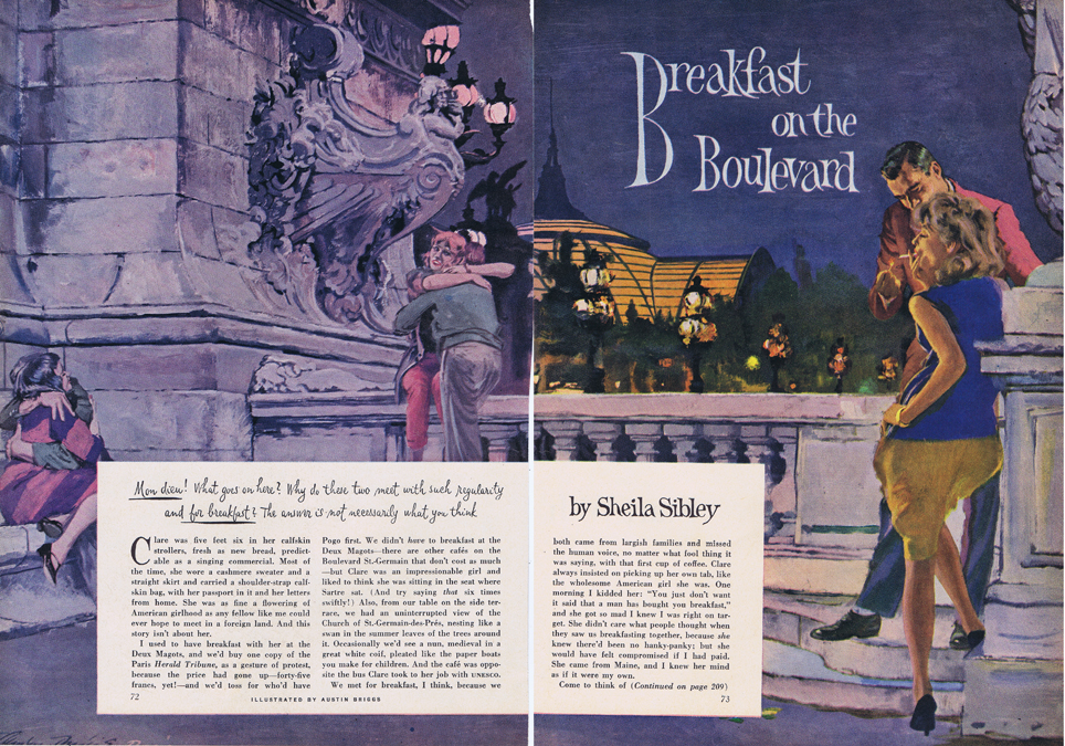
Austin Briggs

  
In the 70’s there was a retrospective of the great newspaper strips that featured a figure or Flash Gordon drawn not by the creator, Alex Raymond, but by some guy named Austin Briggs. As a youthful idiot, I was incensed by the outrage - who’s Austin Briggs?

It wasn't until much later that I discovered more about Briggs and what a talented illustrator he was. Born in Humboldt, Minnesota in 1909, Briggs was raised in Detroit, Michigan where he studied art at City College. His first jobs were drawing figures of fashionable people to enhance automobiles in advertisements.

As this work went out of vogue, jobs were hard to find in the Depression, and Briggs turned to doing comic strips for a number of years (during which time he did the offensive Flash Gordon figure.) He was also moonlighting for Blue Book Magazine doing several illustrations a month from 1935-45. As Briggs recalled: “These were experimental years. I explored new compositional approaches, new techniques or variations of old techniques, and new manners of working with limited means.”


In the 40’s Briggs was developing as a great commercial success, but he felt something lacking in his work: his own individuality. When problem solving he always turned to others for for solutions, usually the current popular favorite. Feeling he was losing his ability to learn and observe from nature, he took a sabbatical to the Gaspe Peninsula in Canada for four months. Here he sketched and painted anything and everything from nature.

Briggs felt this trip was a “declaration of independence”  and his future work became more intrinsically his own. But for Briggs this trip was only one of a series of continual steps forward, because like all dedicated artists he refused to stand pat on his achievements and constantly searched for the means to improve himself. He started out a good draftsman with an understanding of the black and white medium and ended up one of the most brilliant painters and designers in all of illustration.


With his friends Robert Fawcett, Al Parker, Albert Dorne and several others Briggs was one of the founders of the Famous Illustrators School. His abilities as a storyteller and communicator also made him an excellent instructor.


(Briggs using his friend Robert Fawcett as a model in an illustration.)
In 1969 he was inducted in the Society of Illustrators Hall of Fame. His work, constantly in demand, appeared in the Post, TVGuide,Look,Cosmopolitan, and many other publications. He died in Paris in l973.

And I wasn’t all wrong about that Flash Gordon drawing. Raymond’s work exuded sexuality and  romanticism. A realist and a naturalist, Briggs couldn’t compete when imitating Raymond. But when he became his own man, that was another story. Hanging in a place of honor in my house is an Austin Briggs drawing- I’ve yet to shell out for an Alex Raymond.


Briggs'  job description of an illustrator is well worth remembering:

“The illustrator must combine the knowledge and talents of a dramatist, stage designer, costume designer, director, stage manager, lighting expert, photographer, research man, advertising man, art director, salesman, diplomat, accountant - and painter! Every illustration he makes involves all these varied skills and talents. Unless he is accomplished in these fields , his technical abilities as an artist will be of little financial value to him. It is true that what he finally sells is a painting or a drawing - but the actual art work is only the final culmination of many different kinds of activities which are completely foreign to the purely aesthetic painter.”- Austin Briggs

There are several more Austin Briggs illustrations up on my Flickr page.

Sunday, August 7, 2011

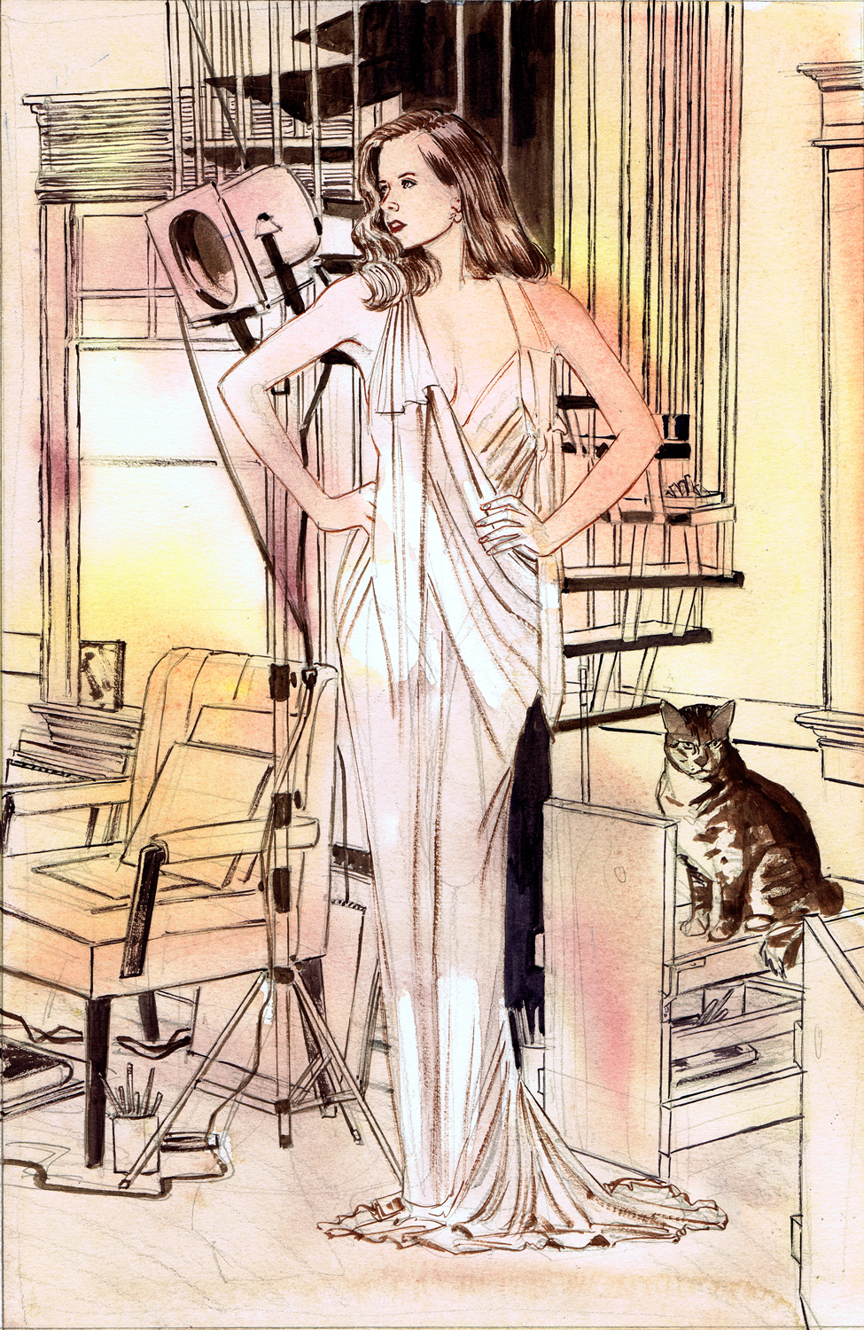
Amy At Bill's- AcrylicPaintingDemo


Here's a quick demonstration of my painting process. I usually have a stack of reference pictures that have caught my attention from various sources. I periodically go through and pick out things that I think I might like to draw in my sketchbook, or use for paintings.

In this case the reference was a photo of Amy Adams from one of my wife's magazines, an old photo of my friend Bill Stout's studio (when it was still relatively uncluttered,) and a snap I took of my cat Repo's mother Maw, a beauty that my wife rescued from a feral lifestyle.


The first step was doing a little rough combining all the reference material. (Upper left. When I am at the drawing workshop at Bill's I tend to do one or two life drawing sketches on a page. Then as another type of compositional exercise, I add little doodles around them- either roughs for future paintings
of little studies of anything and everything. You can see more of these if you check out the sketchbook section of my Flickr site.)

Step two was doing a detailed pencil study for the painting. I'm usually very linear in this approach,
with the only real value studies on the main focus of the planned illustration.At this step I want to make sure that the drawing and perspective are correct, and  eliminate any compositional problems, such as the ever present tangents that always show up. This drawing was done with a 2B pencil on illustration board (which is Bristol Board glued to a thicker backing.)

 
I next tape the drawing down on a piece of masonite (since it tends to warp and curl with the very wet approach I use to painting). I then do a quick wash of watercolor over the entire piece to have something to work against. Like the pencil, the watercolor will eventually be painted over. I did leave a bit of white on the dress and window, since I felt those might be white in the finish.
 

I work with Liquitex Acrylic paints since they are fairly smooth to put down. I also tend to water them down so it's almost like working in ink (but without the shellac they put in commercial acrylic ink). Using a mixture of Burnt Umber, Ultramarine Blue and Cadmium Red Light I draw everything in lines of varying degrees of darkness. I use sable brushes that can give me a good bit of control
for this step, usually a #1 or #3.
 
Taking the same three colors, I mix up pools I can use as washes to create a series of values. In this case, I tried to keep the benches, chair and back wall with warm neutrals, and the floor and trim with a cooler, and darker neutral.I use acrylics as if they were watercolors, but they tend to dry much darker and are essentially lightfast. But in the course of a painting, my board is going to see a lot of water. When I apply washes I use as large a brush as the area I'm working on will allow.
 
 
I continue with the process of washes, adding darker values to the floor and trim to create more of a feeling of depth. The window is far too light and needs to be toned down. I've also added on a lot of white opaque to create highlights on  the hair and skin, and have started to flatten the dress with a coating of white. I've also added on a few highlights on Maw.
 
 
Painting is all about trial and error , and the beauty of the the studio today is that we can try things in Photoshop to see if they might work. I rescanned the painting and started working digitally. In this case, I've intensified the dark values and added a lot more opaque white. In terms of value, this is
pretty much what I want for the final picture.

(I should have taken a couple more scans during this process so you could see more how it progresses.) First off, using the Photoshop study I brought all the value in the  background up to a finished level on the actual painting. I opaqued the window to a murky yellow that pops against the flat white I used on her gown. On the step and the braces, klieg light, tablets,etc. I've added opaques to pop things.

 
 The most defined areas were first doing the finishes on Maw, by adding a very dark value with some opaque white and orange highlights. I then added the fleshtones  and highlights on Amy, and tried to create as readable a likeness as possible, adding in the extreme darks and then highlights on her hair.

Over all this I washed a bit of local color using a very warm pallet. I generally use very little color on the paintings. I like a lot of neutrals with just a bit of color to pop things.Over the entire painting I added a wash of very light yellow orange. When this was dry, I went back and punched up the white on the dress and a few highlights on her flesh.


The final step was adding a thin wash of glazing medium, which both adds a sheen to the work and increases the brilliancy of the colors.

Whenever you're working on a painting, when to stop is always the major consideration. All of us have stacks of things where we should have quit earlier; and that is balanced by looking at a framed painting sometime later and realizing you should have taken it a couple of steps further. And there is always a spontaneity and life in the work at some time in the process that is always so difficult to keep in the final product. 

I'm certainly not a proponent of "my way or the highway", especially with something as nebulous as the process of painting. If something works, stick with it, if not, continue on your highway and enjoy the ride. That's what makes the creative process so interesting.

Saturday, July 30, 2011

The Hollywood Club


(Storyboard frames from Prince Caspian, by Mike Vosburg.)
Life as a freelancer is always precarious. I was offered a job last week working on the proposed remake of the James Thurber classic,  The Secret Life of Walter Mitty .  In this slow economy, this was major excitement. However, once I talked with the coordinator, I was told politely that they couldn't  hire me because I wasn't a member of the Local 800, the Hollywood live action storyboard union. Despite my resume and list of credits, I've had this same situation happen a number of times over the years. It's always a source of frustration.

Unions are essential for an educated, talented  and utile labor pool. I was in college when I started my first real job in the summer of 1966 ; I worked at Yellow Truck and Coach in Pontiac, Michigan, making busses.I became a member of the union. When I started teaching school, I became a member of the teacher's union. When I started my comicbook career, there was no union, and despite the attempts of many of the older artists to establish a guild, nothing really came of that venture. I saw firsthand how difficult it was to negotiate with a company on a solo basis. When I moved to LA in l985, I started working in animation and I joined the union and I am still a member.

 (Storyboard frames by Trevor Goring for National Treasure.)

But a few years later when I wanted to move into live action films, I tried to join their union and was told I couldn't join. You had to have a job to get in the union; to get a job you had to be in the union. (You figure out the logic.) If you are a qualified person looking for work you will always be welcomed by a true union, because they understand implicitly that there is strength in numbers and solidarity.

(Storyboard frames from Skycaptain by Anson Jew.)

If you are a qualified worker seeking employment, you are eligible to join the union. The problem that we have with the live action storyboard "union" is that its leadership has chosen not to represent  a large section of its constituency. In the movie Norma Rae Ron Leibman plays a union organizer in the south who runs into resistance from a group of white workers who don't want blacks in the union; his answer was simple and elegant:"Anytime you have a union that excludes a section of the work force, you don't have a union, you have a club."
(Frames by Tom Nelson)

If admission to the "club" was based on a qualified entry process that might be more acceptable.But there is no portfolio review or even apprenticeship in the process. If artists were being  excluded because of race, sex, or age there are fair hiring laws to protect us. Myself and others aren't being blacklisted, as many creative people were in Hollywood in the 50's, we are simply being "non-listed".  The "club" process is supremely arbitrary. If you're in,you're in, if you're not, you're not.

(Storyboard frames by Aaron Sowd.)

The great irony of course, is that virtually the only way you can get in the union these days is by becoming a "scab" and taking a non-union job. The hope is that the project will go union, and you will be "grandfathered" in. The union and their membership always caution us not to take those jobs, since we are hurting their bargaining position whenever we do so. But if you don't take those jobs, you will certainly never be admitted to the union. It is a "catch 22."


(Storyboard frames by Josh Sheppard.)

I used to think I was the only board artist in Hollywood with this problem. Unfortunately, what I have discovered as I have talked to more and more people  in my field, is that there are just as many, if not more, storyboard artists who have both the ability and the experience to do the job but are excluded, as there members of the storyboard "club." And now the Local 800 is currently expanding, seeking to unionize the Previz sector of the industry. But while new workers are being sought out for the "club" those of us who have long sought membership as  qualified board artists are still being excluded and denied representation.

Imagine that you wanted to make a film and cast a John Hamm, Robert Deniro or Mila Kunis, but were told you couldn't use those people because they weren't in SAG, and couldn't join. What happens is that you are creating a product without having access to the all of the best people who are available. For management and the studios the negative side is that there are excellent people available for jobs that you can't use. The positive side for these groups is that in fact you have a large low income labor pool constantly available. And for the Local 800 that means you've lost a lot of clout as you  negotiate from a weakened position.

(Storyboard frame and concept design by Jerry Bingham.)

The job that we do is very competitive. When I was teenager working on my comicbook fanzines with dreams of working as a cartoonist, my competition was perhaps 500 other kids across the country who had the same dream. Now there are at least 500,000 young artists across the world who all want to do this work...and the number of new jobs have not expanded in proportion to the labor pool. The only way you can stay competitive is to continually improve on your abilities and to market yourself efficiently. Now you have the added difficulty of being excluded from the prime jobs.

If you are one of the few in the "club", you can shrug your shoulders and smugly feel secure that you will have job security. But that certainly isn't what a union is about. The Animation Guild has never excluded members, and Local 800 members are always welcome to join if they want to work on an animated film. But when members of the Guild try to apply for union jobs, they are turned away. It is not a matter of us trying to steal  your jobs. The only thing that will protect your job in the long run is your skill level, not a discriminatory practice against those with similar skills.

(More Prince Caspian boards by myself.)

I don't expect this entry to suddenly change the union issue in Hollywood. There are complexities that I am certainly not privy to and don't understand. However, I do implicitly understand from reading history just how ineffective a union stays when it restricts membership, and refuses to represent its constituency. This is particularly distressing when you become aware of how small the number of unionized live action board artists is compared to the actual labor pool.

I'm reminded of Ben Franklin's quip as he signed the Declaration of Independence:"Gentlemen, we must all hang together, or we will certainly all hang separately."

(In all of the artwork I've posted I've avoided specifying which artists are union, and which are non-union since I think the latter title belittles our abilities. Maybe you can figure out why the Local 800 refuses to represent some of these artists.)


(Frames that I did for an independent film called Beheading Buddha.)