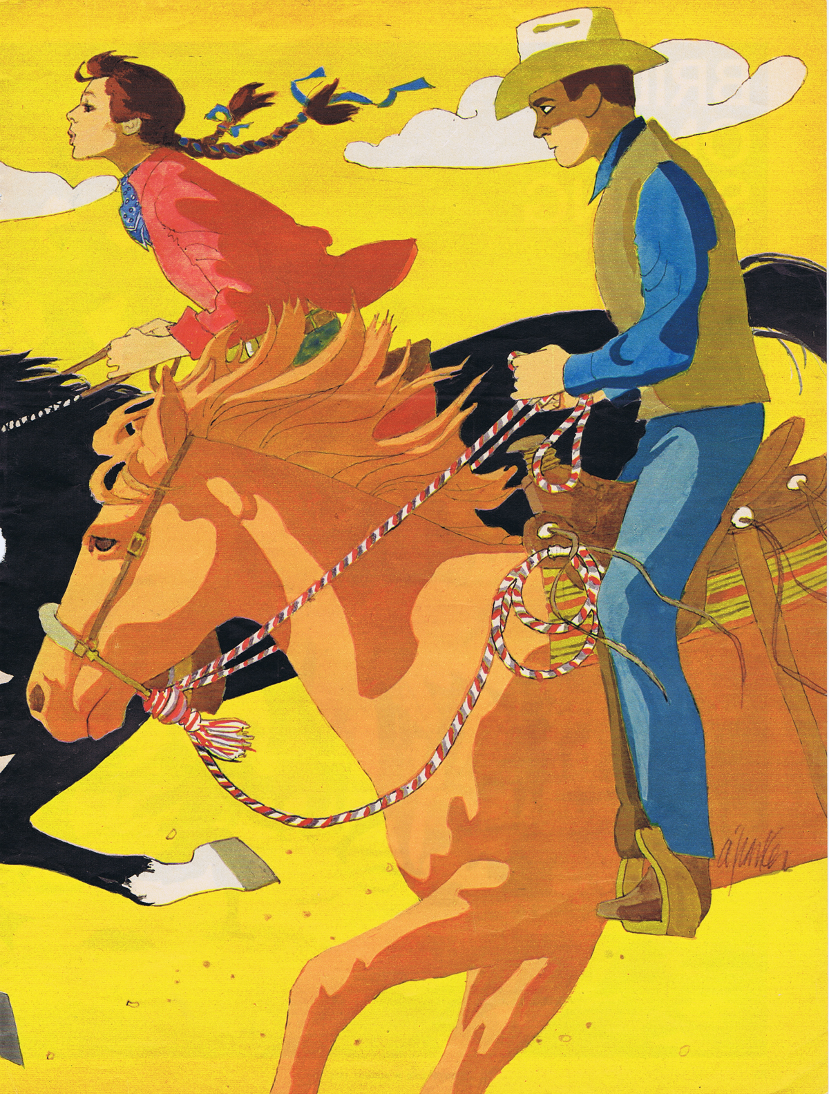
Friday, February 24, 2012

Life After Comics


"…the occupational hazard is my occupation's just not around…"
Jimmy Buffett- A Pirate Looks at Forty

I really love comics; they're what made me want to draw. I've never thought of myself as an artist, always a cartoonist- a storyteller.

For the first time in my adult life I don't have any kind of a comics project that I'm working on in any form. The irony is that when I was younger and wasn't very good at what I did, I always had lots of work, but as I acquired skill and taste, the jobs got harder and harder to find.


Part of that is the reality of working in any form of the entertainment business. A bigger part is that commercial comics as an industry died in the early 80's. There are still a lot of folks living off the carcass ( especially in the movie industry), but no one does comics just to make money off comics- because there is none. It's all in the ancillary income.

I don't think I've had half a dozen paying jobs in comics in the past twenty years, but I still remain enamored with the art form. There isn't an instant's regret for the all the unpaid time I've spent on my Lori Lovecraft and Retrowood projects. Most of the commercial books I worked on in comics I always thought were crap- but I'm extremely proud of my independent work.

But the work is intensely demanding. And my energy level isn't what it used to be. If I continue to work on comics, the reality is that I don't have either the time or energy for anything else. And the bottom line has really nothing to do with money. The reality is that I simply don't have the passion required to produce the material anymore, or the outside stimulus to keep at it. I don't want to just do comics; I want to do  better comicbook work than I have ever done before. I just can't see that happening in the current circumstances.


While I never say never, I am hoping to take a bit of a sabbatical from comics and work more on my illustration- which is another labor of love with a minimal monetary return.

But it sure is fun!


So here are my latest finished pictures. First there is George Sanders as Gay Falcon, as I mentioned previously the first adaptation of a Raymond Chandler novel (Farewell my Lovely) for the screen. It's always a bit of a problem doing color versions of characters who were filmed in black and white (although it was a process that was used all the time for lobby cards and movie posters). And likenesses are also tricky. It's not enough that your drawing/painting looks like the person, it also has to be immediately recognizable as the person. And the best part of George Sanders was that wonderful voice, which you can't draw or paint.

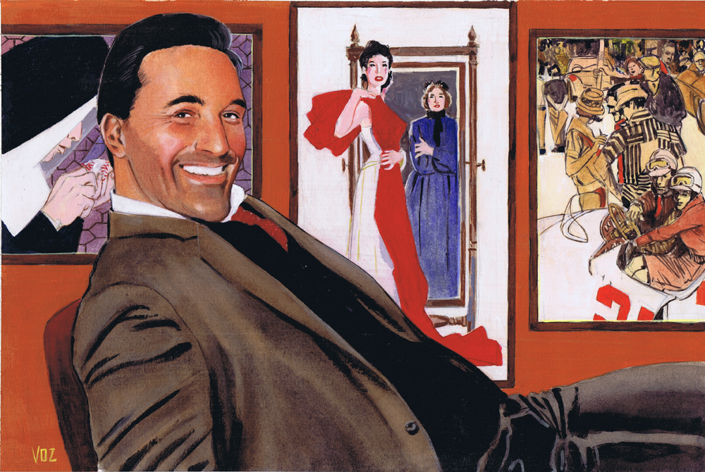

There is also my homage to Jon Hamm as Don Draper of Madmen. It might have worked a bit better if I had Mr. Hamm in a 60's Brooks Brothers suit. But the tribute is as much to the wonderful ad art of that era. It gave me a chance to do some studies of  Al Parker, Coby Whitmore and Bob Peak for the background. I kept the overall color scheme (which I worked out in Photoshop at an early stage) very warm, with a few cooler neutrals, similar to the Sanders picture.


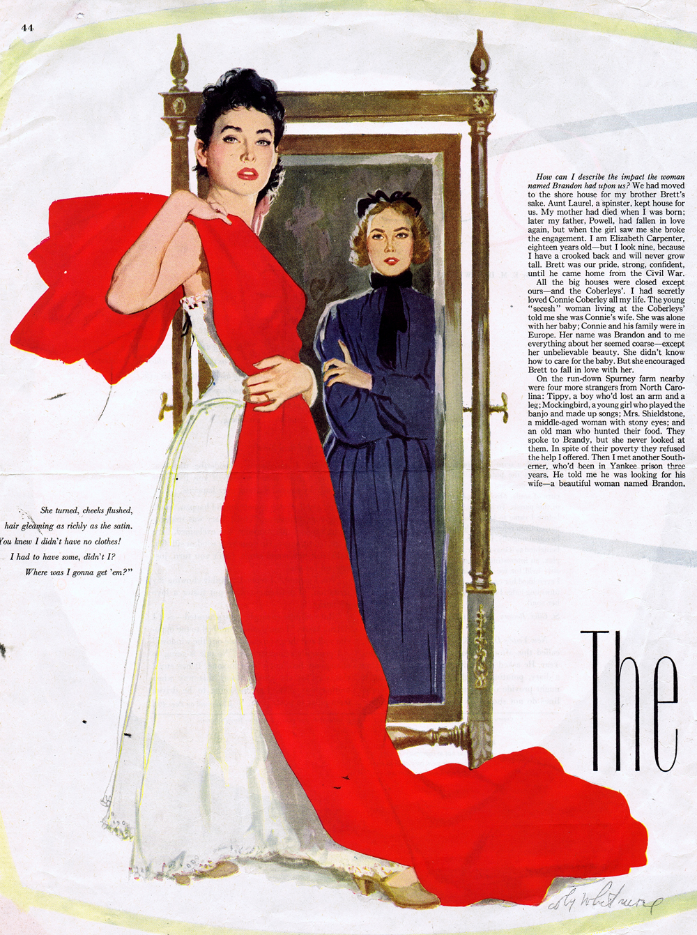
(Above were the three illustration I copied from Al Parker, Bob Peak, and Coby Whitmore.)

And of course, there is another watercolor- one of my former cats Jezebel and Sand Serif.


Next it's on to a portrait I've started of Bill Nighy, and another of Barbarella visiting Falling Water.  I can't wait; actually I won't. As soon as I'm done typing this blog it's back to the drawing board.


[Blogmaster's Note]: If you're having some trouble with certain elements of the blog, like checking out older posts in the Archive, it may be caused by issues with the newest version of Firefox. Try Explorer or Safari.

Friday, February 17, 2012

Practice, practice, and more practice


Lately the job I was doing and a lingering cold have completely destroyed whatever schedule I was trying to keep on this blog. But since the job has ended and the cold is finally not getting any worse, maybe I can get back to posting again on a regular basis.


For now I'm just going to stick up what I've been working on the past couple of weeks. Inspired by friend Norman Mallory, I tried doing a watercolor portrait. Actually, I started this thing four or five years back and it just sat on the shelf unfinished. I finally pulled it back out and jumped in and finished it up. The big thing I apparently learned in that time was start working with a lot bigger brushes.


There are some new kitty paintings. I never get tired of drawing my feline friends. And they charge so little for modeling fees.


There are also a couple of pieces in progress. Here are the pencilled versions of portraits of Jon Hamm and the original Saint, George Sanders, who also was the first actor to play Raymond Chandler's Philip Marlowe. Of course he wasn't called Marlowe, but Gay Falcon, in the l940's "The Falcon Takes Over", the initial adaptation of "Farewell, My Lovely. There's also a version of the two pieces at there present stage.

Tuesday, January 10, 2012

Al Parker (1906-1985)


The invention of the camera shattered art in the western world. For several centuries one of the primary goals of the artist was to reproduce as realistically and objectively as possible life as he saw it. Products of the industrial revolution, artists struggled with the disciplines of draftsmanship and perspective with the ultimate goal a photographic likeness. Cameras made that approach obsolete, and 150 years later the art is still reeling from the fallout.


This same situation happened in the field of illustration, though it took a while until the printing industry could catch up to produce economic photography. As the process began to happen between the world wars, the magazine illustrator - once a celebrity as popular as actors and athletes- has become an endangered species.

Al Parker worked, survived, and prospered through a long period of this upheaval in illustration. Witnessing the changes constantly besetting his colleagues Parker became  the greatest innovator of his era, continually altering and adjusting his style to fit the dramatically changing times. Where others copied the latest trend, Parker created them.

The grandson of a famous riverboat pilot, Alfred Charles Parker was born in St. Louis, Missouri. While still at the St. Louis School of Fine Arts, Parker often supported himself playing saxophone and clarinet in his own jazz band on riverboats steaming up and down the Mississippi. Louis Armstrong and Dizzy Gillespie were among his friends and although a career in music was an option,  art was his primary interest.

In l935 Al moved to NYC with his wife Evelyn and his family eventually settled near the NY/Conn. border, the home of many of the major contemporary illustrators .He became  a regular contributor to Ladies Home Journal, Good Housekeeping, Cosmopolitan and the Post as well as many other magazines working on both story illustration and advertising.


His very early work reflects an art deco influence. His brilliance was in creating “glamour”. In the 1940’s his “mother and daughter” covers, where both wear matching outfits, set a style imitated by women over the next generation.

Parker worked in all mediums from oil to gouache to ink to color pencil; he was fearless in experimenting and trying new and fresh styles with his pictures. His graphic approach to design, mixing his solid drawing ability with the use of negative space and flat color, served as a jumping off point for Bob Peak, Bernie Fuchs, Ted CoConis and so many other illustrators in the 60’s.

But along with the graphic technique, what has always impressed me about Al Parker was his fascinating use of the model’s mannerism and gesture. He preferred to work from life rather than photographs for this reason. His illustrations are filled with subtly positioned hands and half hidden faces, often tightly cropped, always reflecting more emotion than an overtly placed expression.

Along with Robert Fawcett, Albert Dorne and Fred Ludekens, Parker was one of the original founders of the Famous Artists School, still the best compilation of how-to information assembled for the student of picture storytelling. (Originally Parker, Dorne,Von Schmidt, Fawcett and Briggs each did separate volumes which were compiled into the final course. I have copies of the Briggs and Fawcett; anyone out there who can provide me with a xerox of the Parker, I would forever be in your debt.)


 The Parkers moved to Carmel, California in the early 60’s, where he spent the rest of his life continuing to work at his craft. A guiding force behind the establishment of the Monterey Jazz Festival, he also never left his music.

(Thanks to Fred Taraba, Walt Reed, and Dugald Stermer for information from their writing on Al Parker gallery. His magic goes on.


Above is a sampling of some of Al Parker's great illustrations, but don't be afraid to google this incredible illustrator for more images.

Wednesday, December 28, 2011

Moriarty, The Lazurus Tree


 This month I  have an issue of a comic book out on the stands. It is Moriarty: The Lazarus Tree, published published by Image.


Moriarty is the brainchild of  writer Daniel Corey and artist Anthony Diecidue, and of course the central character is the villain from the Sherlock Holmes stories. However, Dan has added a number of interesting twists to the plots and has really explored the character beyond his relationship to Holmes. The series is a fun read and watching both these creators develop over the past couple of years has been a treat. (They also have a trade paperback version of the first series, Moriarty, the Dark Chamber, that is available.)


(Lira posed for a number of Retrowood paintings I did for development.)
Anyway, Anthony had a big wedding coming up to the lovely  actress and model Lira Kellerman, and this slacker actually wanted to take some time off from his schedule for a honeymoon. So I got recruited to do a fill in issue. Because of my schedule, I realized I'd have to do the job very quickly, so I decided to approach the work less as I would a traditional comic and instead draw it as if it were a storyboard. People are always hounding me to have my comics have more of the spontaneity of my boards, so I thought I'd give it a try.


The entire twenty pages took my seven working days, and I don't think I ever worked more than 7-8 hours a day. There certainly is a freshness to the finished work that I really like. Dan was gracious enough to provide me with excellent reference on the stories specifics, so I didn't have to spend much time on that. I was also very familiar with the period so my reference time was kept to a minimum. And I had the excellent help of my assistant Mitchell Reslock, who handles all the hard stuff I didn't want to spend time on, like backgrounds, spotting blacks, erasing, scanning,etc. Ideally, I'd love to just have him do all the work and then I'd just sign it.


Of course Anthony couldn't keep his hands out of the mix, and he ended up coloring the book. A beautiful job that really takes the work to another level. But that was hardly a surprise since I've worked with Anthony on a number of jobs and have always loved the results. (As I finished the comic in record time, it was ready to go months ahead of schedule. Consequently, Anthony also had me do layouts for the previous issue, which you can also probably find at your local comic shop.)

So break open that piggy bank and head down to the comic shop and look this stuff up. You'll thank me.

Tuesday, December 20, 2011

Prom Night at the White House


    In 2008 I had the chance to storyboard a documentary called Prom Night in Mississippi. The story revolves around a school in the South that, in the 21st century, still had segregated proms (one for blacks, one for whites). Morgan Freeman, who was from the area, offered to pay for the prom and everyone's expenses if instead there was simply one integrated prom. While a majority of the students readily accepted the offer, and plans went ahead, a small segment of the school and their parents insisted on having a "whites only" prom.


(Director-Producer Paul Saltzman and producer Patrica Aquino on the road outside the White Prom.)
    Paul Saltzman, the director who had been shooting footage of this from the beginning, now ran into a snag. He was denied access to film anything connected with the white prom. Paul needed a series of illustrations depicting all of this action. That was where I was called in.


    I wound up doing about thirty plus drawings for six or seven sequences. Paul was always really easy to work with. (With what he was paying me, he couldn't afford to be too picky.) And the project was one I was extremely proud to be a part of. (Two out of three isn't bad.) When I wound up watching the finished film I found  it intensely engrossing; Paul brought a warmth with his interviews with the students that made the film a very personal experience. It's definitely worth  adding to your Netflix list.


  Recently Paul sent me an email to let me know there was going to be a special showing of the movie at the White House. So just in case he'd never seen an episode of Tales from the Crypt, G.I. Joe, or any of the Narnia movies, President Obama was now going to have a chance to view MY work. I'm excited about this. However, when the president does see my drawings, I hope he realizes that, like many Americans, I am often looking for work that is usually hard to find.