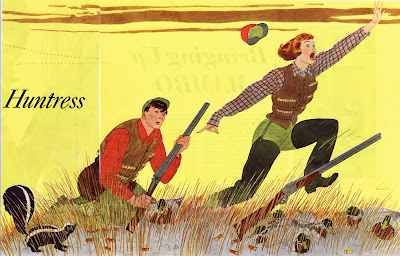
Harry Beckhoff (1901-1979) began his pictorial compositions with small sketches that were almost literally thumbnail in size. These tiny drawings contained all of the information needed for the final rendering- even down to facial expressions. He then pantographed the drawing, about five times larger, and inked in the outlines. The tonal or color areas were painted in in flat washes.
Beckhoff describes his work as having been influenced by the French illustrators Martin, Brissaud and Marty. He also cited his teachers, George Bridgman, Dean Cornwell and Harvey Dunn for their encouragement and training.
Beckhoff worked for many periodicals including Reader's Digest, Saturday Evening Post, but he was most closely associated with the wonderful Broadway characters he drew to illustrate Damon Runyon's famous stories which ran for many years in Colliers. (He shared a similar association with the P.D. Wodehouse characters Jeeves and Wooster in the same magazine.)
(The above transcribed from Walt Reed's wonderful book on
The Illustrator in America . A must for anyone truly interested in the field. If you aren't, you should also be aware of Illustration House:
http://www.illustrationhouses.com/wp-content/uploads/2013/06/exhib/a45/a45pages/a45_054.html)
 |
| (One of Beckhoff's tiny crowd drawings and the revision.) |
Beckhoff continues in the tradition that runs from Hans Holbien to Alex Toth, of exceptional artists who seem to produce drawings with both a simplicity and spontaneity that belies the careful planning and effort. And in Beckhoff's case, the humorous subject matter off undercuts the depth of the material he created.
His preparation for an illustration was meticulous. He would first create a his tiny thumbnail. I would love to use the adjective "rough" here, but often the these drawings were as complete as the finish. You see this a lot in Bob Peak's work, but his preliminaries were never that small. The closest thing I've seen to what Beckhoff did was Alphonse Mucha's drawings done in a 3" x 5" Moleskin sketchbook for the lifesize produced theater posters of Sarah Bernhardt; you could see every line in this huge poster in this very small sketch.
Sometimes his preliminaries would be in the form of a watercolor, or more often,
color pencil drawing. If unsatisfied with the composition, he would then cut up the drawing and move the elements around to refine the picture. Or he might add or adjust elements using tracing paper overlays. But before he jumped into creating the final illustration, the majority of the thinking work was completed. What followed was technique.
 |
| (This guy even made golf look fun.) |
Once he had blown up the drawings using a projector, he would create an ink line drawing. On top of this he would lay in washes of tone and color. It was a process used by Dorne, Fawcett and many other illustrators. At any rate, the spectacular finished illustration always seemed to be produced with a ho-hum and a wave of the hand. Nothing could be further from the truth.
(Beckhoff's working method is described much more accurately and completely in Fred Taraba's wonderful book,
Masters of American Illustration, 41 Illustrators and How They Worked. Like the Walt Reed book, it's a must for any student of the craft. And if you are ever looking to purchase illustrations originals, you definitely want to visit Fred's website:
http://www.tarabaillustrationart.com/


Great article Mike, thanks for sharing. "drawings with both a simplicity and spontaneity that belies the careful planning and effort.", so so true!
ReplyDeleteI love Beckhoff's work so it's a great great pleasur to have the opportunity to see some images I don't know. I will make a post about your post on my blog :-)
ReplyDelete