Wednesday, April 4, 2012

Why We Lose Out on Jobs


"I wish that I knew what I know now, when I was younger"  OOH LA LA   Ron Wood/ Ronnie Lane

      In the competitive world of commercial art there are thousands of reasons for being passed over on a job. Race. Sex. Ageism. Religion. Politics. Style. Dress….just to suggest a few of the semi-logical ones. When you lose out on a job, it's easy enough place the blame on exterior issues that are completely out of your control. And often, that might be entirely correct. But after you get over consoling yourself with whatever explanation you can come up with of why the world has it in for you, it's time to answer the more difficult question: What could I have done to give myself a better chance on this job? How do I need to change and improve my approach next time?


The following 8 pages are storyboards I did for the wraparound sequence for the Tales from the Crypt: Demon Knight film.

When I was working on the Tales From the Crypt TV series, my goal was to break into storyboarding for live action. I had worked in animation for a number and years and knew the routine for that fairly well, but live action was an entirely different story. I didn't know anyone who worked in this area other than a couple of animation folks who had picked up a few jobs doing low budget films. So working on Tales was a godsend. I was surrounded by the best directors in the business. It seemed a no-brainer that I'd soon be working regularly for them once they saw what I could do.


And I had my chances. I worked on a segment with Robert Zemeckis for a TV project he had planned. I did extensive board work on one of the crypt episodes for John Frankenheimer, and also a few action sequences for other stories during the run of the show. But it never led to much. While I was reshuffling some files around my studio last week I came across some of the boards I was doing at that time, and suddenly a lot of things made sense. Quite frankly, when I did have the opportunity to do live action boards, I was giving them crap.


The biggest problem was that I was far more interested in showing the directors just how fast (and cheap) I could work, rather than trying to produce the highest quality material possible. While my knowledge of the technical aspects of film was limited, I could draw extremely well. But I certainly don't see any of that proficiency in the boardwalk I was doing. Part of that I can blame on animation; there was the attitude that if your boards were too well drawn it was to cover up your other defects. The bottom line was that I could have improved the work several times over if I had put as much time and effort into the drawing (and composition) rather than hacking it out.


The second shortcoming was that I didn't seek out some of the excellent live action board artists and ask them to critique my work. There were certainly enough of them in LA if I wanted to track them down. But again, I was working regularly in comics and animation and getting a great reception. I wasn't hungry enough to seek out another path and pursue it; I was waiting for directors to call me and have the jobs fall in my lap. That simply doesn't happen.

The Lori Lovecraft pages were done in roughly the same time period, and represented work of much superior quality.

Thirdly, when I was working on the projects, I simply allowed myself to be a wrist. I put down in the frames what they told me. I didn't realize that I should have been more involved in the thinking process and making suggestions about how the work could be shown. I should have gotten rid of a lot of my reticence.

And for all the shortcomings, the boards are still solid material. They tell the story clearly, are well composed, and were what the director wanted. But looking at them now through the eye of experience, my advice to myself would be: Slow down. Go to your strengths and show them how strong a draftsman you are. Punch up a few of the compositions. And most importantly, make the finishes much cleaner and prettier.

When I started working on The Lion, the Witch, and the Wardrobe, I didn't want to produce any drawings that weren't the best I could do.

There are always monetary issues on jobs. (That's why they call it "commercial" art.) One of the jokes older artists are often amused by is the clients line: It will look good  on your resume. Or the even funnier: We don't have much money now, but if the project is a success, we'll take care of you. But when you are first starting out in any business, if your attitude is to only give a client work that reflects what they are paying you, you are shooting yourself in the foot. Too often jobs where you give a less than stellar effort are eventually seen by someone who mentally writes you off their list of someone they'd like to work with. Once you accept a job, even if the pay is demeaning, never give anything less than your best effort. (And when your work is in demand, make sure if those same people hire you again, they pay double.)


Hmmm….maybe I'll head off in my time machine this afternoon and have a talk with my younger self.

Friday, March 16, 2012

That Man From Ventura


A Norman Mallory self-portrait and a watercolor of his sweet wife Mary's garden.


  For this week I thought I would do a dual post of some of the recent paintings that I've been working on and also some of the work of my friend Norman Mallory, who's been a great inspiration and better friend over the past few years. I first met Norman when he wrote to me about the Robert Fawcett illustrations I had on my website. Discovering we lived close to each other, we decided to get together. "You met this guy on the internet- what if he is a psycho killer? " asked my lovely wife. Norman's wife was even more caustic: "What if this guy is a Bushy?"


Portraits of Neil Gaiman and Miles Davis
 Well, Norman was no psycho killer, though like all good artists he is a bit mad. And no one has ever accused me of being a Republican, let alone a Bush supporter. So we hit it off fine. Here are just of a few of the goodies that Mr. Mallory has turned out recently. You can see a ton more of his work at:http://www.flickr.com/photos/7511675@N06/


Pencil drawing of Ralph Steadman and watercolor of Irish coast

   Norman was gracious enough to give me lots of helping (for free) editing the Retrowood material and offering me lots of sage advice on that project. What really astounds me are Norman's portraits and his command of the water color media. His self portraits would probably get a second look from Rembrandt. He's motivated me to try my hand at a couple which I've included below. I am also an influence on Norman as he has recently started painting some cat portraits, and they do have a definite psychotic look to them.


A couple of my kitty cat pictures, a couple self-portraits, and a self-indulgent pinup

Friday, March 9, 2012

Days at Charlton


Mike Vosburg Interview

CS: Please tell us something of your life before Charlton. Things like where
and when you were born, early comics you read, artistic aspirations…

I read all kinds of comics as a kid. There weren’t a lot of superhero titles other than Superman,
Batman and Wonderwoman when I was growing up. There were lots of westerns, funny animal books, Classic Illustrated (my favorites) and lots of mystery comics. These especially appealed to me.


I was never very interested in science fiction, so most of the outer space monster stuff and the majority of the super hero comics that starting appearing in the 60’s had little appeal for me. If I liked the artists, I’d follow the strip, but the stories themselves had little appeal.

After I was about 13 or 14 I don’t think I ever read my comics, certainly none of the Marvel stuff which truly bored me. I was much more interested in reading books. For me comics were essentially a visual medium, so I loved looking at the illustrations and emulating them.


My favorites artists were Joe Kubert, Russ Manning, Al Williamson and Kurt Shaffenberger in comics and Leonard Starr and Hal Foster in the newspapers. Steve Ditko was the Charlton artist who really appealed to me. I loved his otherworldliness.

CS: Can you remember your first Charlton comic? Any particular titles,
characters or series that stand out in your memory?

My first Charlton story was “The Arena of Lost Souls.” I was working for DC or Marvel at the time and there kept me fairly busy pencilling, but they never let me ink the work.


Al Milgrom, (who very kindly always let me stay at his place when I was in NYC) and I took the train up to Connecticut to meet with Nick Cuti, who was the editor then. I’ve worked with Nick since on a few animation jobs here in LA...always a great guy. We also met George Wildman who looked over our work. I think we both got a couple scripts to work on. The attraction for me was that I could ink the work myself.
Looking back on my beginnings in comics I always had good people inking my work, but the end result was always so foreign from what I was attempting that I can never look at it enthusiastically. When I look at the work I inked myself I see a completely different artist. When I failed, I failed utterly because there was no seasoned inker to correct my mistakes. But I found that when I inked my work I took the pencils to another level. I pretty much knew what I wanted in terms of style, but lacked the drawing skills and technical tricks to get there. Because I wasn’t finishing the majority of my work, I wasn’t aware of the problems I was causing for the inker...once I had to do the work myself I had a much better understanding of how to resolve the problems.


As a result, the Charlton stories I did and the Star*Reach stories were my favorite stuff from that period of my career.

CS: At the time of your work for Charlton, George Wildman was the editor.
Can you describe your contact with him and any other persons associated with
the Charlton outfit?

MV:

I did a total of four horror stories, two romance stories and two covers and three separate one page fillers. I also did the one war story. I was (and still am) very anti-war and not very enthused about doing the war story. I think Nick asked me to do it as a favor. I wound up doing the entire job with swipes from Joe Kubert’s Sgt. Rock stuff, so at least it had some appeal.


Ironically, the most financially successful comicbook I’ve been connected with is G.I. Joe. When people joke with me about drawing pornography because of my Lori Lovecraft stories, which are truly innocent and inoffensive, I always like to point out that the only REAL pornography I’ve worked on is GI Joe.

The horror stories were always great. The first was  “The Arena of Lost Souls” about a doomed businessman (the character was actually a swipe from Mary Perkin’s agent from the Leonard Starr strip) who tries to cheat the devil in a fight to the death. He picks out the puniest guy in the place. As they fight a full moon rises...of course the guy is a werewolf. Where the art works, it really works. Where it doesn’t, it’s really amateurish.


In “A Nice Place to Die” an old couple saps the life from a worthless young couple. (Ghostly Haunts #39.) My favorite was in Ghost Manor #23, “It’s a Gas”, written by Nick, about a young girl and a con man named Calabah Quint. I think Nick wanted to do more stories with the character, but nothing ever happened.


The last horror job was certainly my best effort. I remember the late Grass Green gave a me a hand lettering the job and ghosting some of the pencils...and the story was appropriately titled  “The Grass is Always Greener.” (Creepy Things #3)


When I was doing the romance stuff I was very much influenced by Frazetta’s “Untamed Love” stories and a Spanish cartoonist named Carlos Jimenez (Dani Futoro and Delta 99), a more unlikely combination you couldn’t imagine. The Frazetta stuff was so rendered and realistic and Jiminez's work was always so cartoony and stylized.


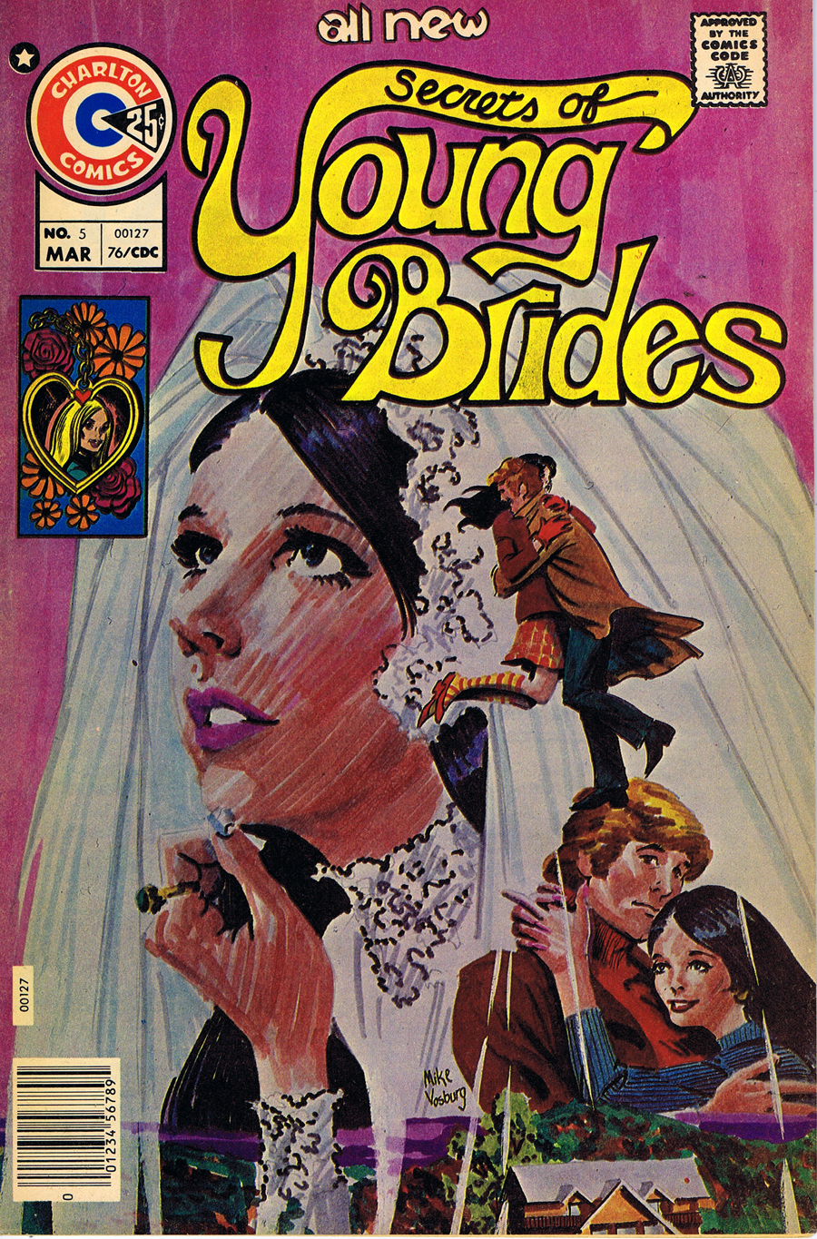
 I really enjoyed drawing pretty girls, so the romance stuff was always fun to do. My first samples for comics were actually romance pages I showed up at DC to Vinnie Colletta....but that’s another story. The one painted cover I did was perhaps the only painted cover I ever did for comics. I remember
using markers and it looked like it. Not a bad design but the color and execution left a lot to be desired. (Secrets of young Brides #5.) The cover to “I Love You” #120 was inspired by Bob Peak...still one of my favorite early efforts. I think I was probably getting a lot of input from Howard Chaykin and Walt Simonson at the time.


MV:
My other Charlton memories are designing a character (a woman with a short shag haircut, abbreviated leather outfit and whip) for a strip Nick was planning. It eventually went to another artist and Nick apologized profusely. My attitude was if there was a better artist for the job, they should go with him. This is not a business to be in if your feeling are easily hurt.

I also remember doing a short story for Bob Leyton’s Charlton fanzine in early seventies. I forget the character’s name, but I do recall it had a lot of Jiminez and Ditko influence. And Bob has always treated me wonderfully- so it was a pleasure working with him. I remember at the time his ex-wife commenting that if Bob spent a couple weeks practicing, he could probably get a job in comics. I was probably a little skeptical of that time frame, but I recall the next time I saw Bob he was a working professional.

Friday, February 24, 2012

Life After Comics


"…the occupational hazard is my occupation's just not around…"
Jimmy Buffett- A Pirate Looks at Forty

I really love comics; they're what made me want to draw. I've never thought of myself as an artist, always a cartoonist- a storyteller.

For the first time in my adult life I don't have any kind of a comics project that I'm working on in any form. The irony is that when I was younger and wasn't very good at what I did, I always had lots of work, but as I acquired skill and taste, the jobs got harder and harder to find.


Part of that is the reality of working in any form of the entertainment business. A bigger part is that commercial comics as an industry died in the early 80's. There are still a lot of folks living off the carcass ( especially in the movie industry), but no one does comics just to make money off comics- because there is none. It's all in the ancillary income.

I don't think I've had half a dozen paying jobs in comics in the past twenty years, but I still remain enamored with the art form. There isn't an instant's regret for the all the unpaid time I've spent on my Lori Lovecraft and Retrowood projects. Most of the commercial books I worked on in comics I always thought were crap- but I'm extremely proud of my independent work.

But the work is intensely demanding. And my energy level isn't what it used to be. If I continue to work on comics, the reality is that I don't have either the time or energy for anything else. And the bottom line has really nothing to do with money. The reality is that I simply don't have the passion required to produce the material anymore, or the outside stimulus to keep at it. I don't want to just do comics; I want to do  better comicbook work than I have ever done before. I just can't see that happening in the current circumstances.


While I never say never, I am hoping to take a bit of a sabbatical from comics and work more on my illustration- which is another labor of love with a minimal monetary return.

But it sure is fun!


So here are my latest finished pictures. First there is George Sanders as Gay Falcon, as I mentioned previously the first adaptation of a Raymond Chandler novel (Farewell my Lovely) for the screen. It's always a bit of a problem doing color versions of characters who were filmed in black and white (although it was a process that was used all the time for lobby cards and movie posters). And likenesses are also tricky. It's not enough that your drawing/painting looks like the person, it also has to be immediately recognizable as the person. And the best part of George Sanders was that wonderful voice, which you can't draw or paint.


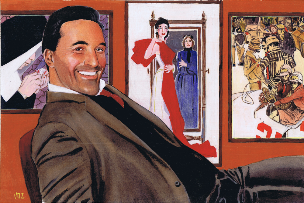
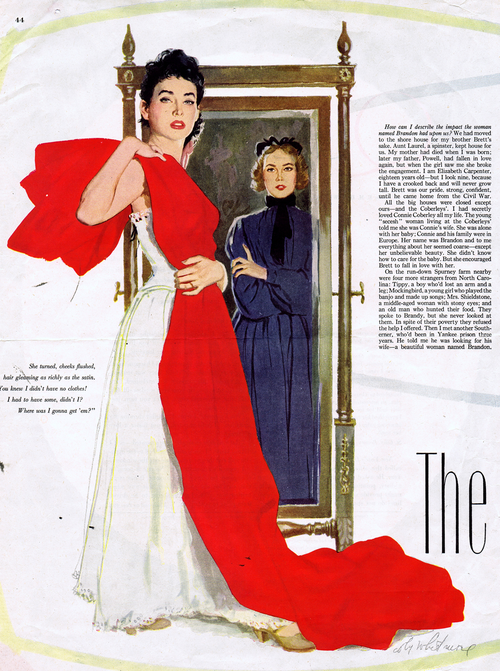
There is also my homage to Jon Hamm as Don Draper of Madmen. It might have worked a bit better if I had Mr. Hamm in a 60's Brooks Brothers suit. But the tribute is as much to the wonderful ad art of that era. It gave me a chance to do some studies of  Al Parker, Coby Whitmore and Bob Peak for the background. I kept the overall color scheme (which I worked out in Photoshop at an early stage) very warm, with a few cooler neutrals, similar to the Sanders picture.


(Above were the three illustration I copied from Al Parker, Bob Peak, and Coby Whitmore.)

And of course, there is another watercolor- one of my former cats Jezebel and Sand Serif.

Next it's on to a portrait I've started of Bill Nighy, and another of Barbarella visiting Falling Water.  I can't wait; actually I won't. As soon as I'm done typing this blog it's back to the drawing board.


[Blogmaster's Note]: If you're having some trouble with certain elements of the blog, like checking out older posts in the Archive, it may be caused by issues with the newest version of Firefox. Try Explorer or Safari.

Friday, February 17, 2012

Practice, practice, and more practice


Lately the job I was doing and a lingering cold have completely destroyed whatever schedule I was trying to keep on this blog. But since the job has ended and the cold is finally not getting any worse, maybe I can get back to posting again on a regular basis.


For now I'm just going to stick up what I've been working on the past couple of weeks. Inspired by friend Norman Mallory, I tried doing a watercolor portrait. Actually, I started this thing four or five years back and it just sat on the shelf unfinished. I finally pulled it back out and jumped in and finished it up. The big thing I apparently learned in that time was start working with a lot bigger brushes.


There are some new kitty paintings. I never get tired of drawing my feline friends. And they charge so little for modeling fees.


There are also a couple of pieces in progress. Here are the pencilled versions of portraits of Jon Hamm and the original Saint, George Sanders, who also was the first actor to play Raymond Chandler's Philip Marlowe. Of course he wasn't called Marlowe, but Gay Falcon, in the l940's "The Falcon Takes Over", the initial adaptation of "Farewell, My Lovely. There's also a version of the two pieces at there present stage.